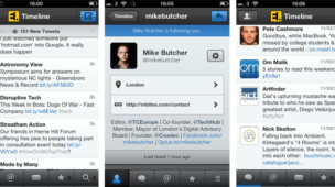
Email is inherently personal and the way people manage it is personal too. Some are super-organisers; filing everything away into relevant folders (or tags), keeping a near-empty inbox with a zero-unread count. Others let their inbox fill up with little structure, clocking up thousands or tens of thousands of mails in one stream, many left unread. Individuals fall into a position somewhere on a line between these two extremes, and admittedly we lean more towards the organised end of the spectrum and so our opinion of the Sparrow iPhone app will be weighted to this use-case.

Sparrow initially produced a desktop email client that closely resembled the mac twitter desktop app in appearance and stripped-back simplicity. We probably do 80% of our emailing through desktop clients during office hours and so found the Sparrow desktop app to be too simple for our needs. The demand to manage many projects and organize mails quickly (dragging conversations directly to a folder) requires a more complex UI provided by such staples as Apple Mail or Outlook. There is obviously a large market for the Sparrow desktop app but it was not we. Then along came the Sparrow iPhone app…
The interesting thing about a mobile application design is the screen real-estate restrictions and the necessary steps that must be designed-into the experience to integrate features such as filing away mails and organising multiple accounts. The native mail app in iOS can do all these things, but are generally achieved in a less-than-ideal user experience involving too many screens and clicks through a tree-like hierarchy. Doing this better is where Sparrow mail shines. The use of gestures to easily access accounts, folders, and gmail specific features such as priority inboxes are all just a swipe away. Folders neatly spectrum labeled and the ability to view either individual accounts or a unified inbox.

Upon installing the app you’re greeted with a very well produced and handy walkthrough of the key features, supported by an equally well-produced feature overview on their sales site.

Adding an account is made to seem easier than any other system we’ve experienced. Just your name, email address and password. Much like the desktop app the feature set is very much tailored to a gmail/Google Apps user with favouriting and users of the priority inbox feature will find this a welcome addition to the app. Swiping the header to access filtered views on your inbox (whole inbox, unread, starred and Priority mail if turned on) is a clever addition.The swipe to access actions form mail list is very useful (a convention borrow form the game-changing Twitter iOS app) allowing access to quick replying, forwarding, tagging, archiving and deleting (the distinction between which still baffles us).

The conversation view is brilliantly handled too, jumping you by default to the last message in the thread, using a pull-down/up to access previous. The pull-down to refresh message list is present of course, something most data fetching, list-based apps now utilise and something we find ourselves doing constantly inside the native Mail app to no avail.

Some more advanced options are available for those who wish to look for them, tidily squared away in a general setting area. Overall it seems like a good alternative to the native Mail. The only thing stopping us using it as a complete replacement at present is the lack of notifications. We tend to deal with email as & when they arrive, so notifications are vital in a mobile app, but imagine a new release will be out soon with this feature added. Once in place we could see this replacing Mail as a day-to-day phone emailing, in much the same way


