Designing native or bespoke app experiences

It’s time to design your app. Regardless of the platform, you will be faced with a fundamental question that has implications for both users and your business: design native or not.

You can build natively or not, but that’s another discussion. We’re going to talk about native design and user experience.

First, let us define what we mean by a native design. When releasing an app, you’re doing so on someone else’s platform. Be it Windows, Mac OS, the web (less of a “platform” but has similar properties), iOS, or Android – each has its own set of conventions and guidelines for how to create an app that feels more native to the platform. Apple has the HIG for its various platforms, Google created material design for Android and the web has a variety of widely accepted, less formalised conventions on how to design different types of interactions, born from decades of trial and error.

Whatever form these guidelines come in, they are only ever that: guidelines. You are free to design your service however you wish, and many do. But what are the advantages and disadvantages of each approach?


It depends how far your service reaches

If your service is something that only exists in one place (eg: it’s an iOS app), it makes perfect sense to adopt the guidelines of that platform. Your users are used to other conventions in that platforms world, and creating something unique to your brand will only lower the usability. Products that fall into this category are likely to have niche applications or be from indie developers. You will want some brand personality in the design, but the core UX conventions should largely follow that of the platform.

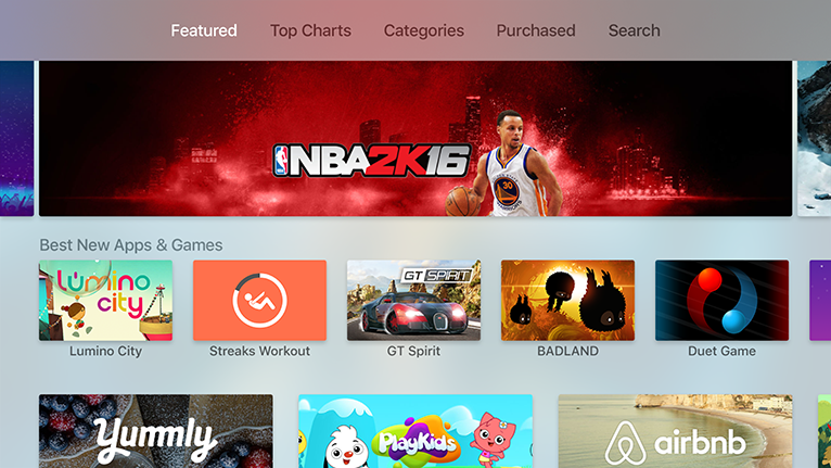
If however, you are on multiple platforms, the decision is more tricky. Larger companies service more customers by ensuring their app is available in as many places as possible. The ultimate manifestation of this is Netflix – one of the reasons they became so widespread so quickly is that they created apps for almost every platform that have a screen and an app infrastructure. But this creates the dilemma of either making your UX consistent across all your apps or choosing to design them native to each platform.


Staying Native

The main benefit to keeping your UX native is that users moving between services on the same platform don’t have to learn anything new. For example, if you release an Apple TV app that has several top-level navigation sections, the established convention is to run these across the top of the window. If you design something non-standard the learning curve increases, reducing the ease at which the users can get to your content, adding friction that affects the experience.

Apple TV app run navigation across the top


You would hope that the platform owners have tested their approach and guidelines extensively, more than you are likely to for a single service. You should be able to trust that they have made the right design and usability choices, taking away some of the testing burdens if you follow their guidelines.

Designing natively usually means you build natively, which comes with its own benefits of being faster to create. As platforms introduce new features native apps are easier to update and quicker to market than their bespoke counterparts.


Going bespoke

The decision here is very use-case dependent. Users of your service might regularly move between platforms, in which case you might think it makes more sense to have a consistent experience between all of your apps. If you have the type of service where users are likely to actively jump from a browser to a mobile app, or mobile app to TV app, then consistency between those will be important. If your users need to re-learn how to interact with your application on each platform they will become frustrated as users expect the service to behave the same everywhere.

You can, of course, have a service that is in many places, but usage patterns suggest most users only access it on one platform. In these scenarios it might make more sense to lean in the direction of native for the core UX and hierarchy.

There may be financial or business benefits to going bespoke and keeping everything as consistent as possible across platforms, but if you are making product decisions this way you’re doing design wrong.


It is a spectrum

The decision to go native or not with your design isn’t black & white. There’s a whole spectrum to choose from and where it makes sense for you to sit on that spectrum will be different for every business. As with most spectrums, the very extremes are rarely the correct choice for anyone. There may be some core fundamentals of a platform that it makes no sense to change, but you want a particular core interaction or layout to be consistent across your apps.


It goes beyond styling

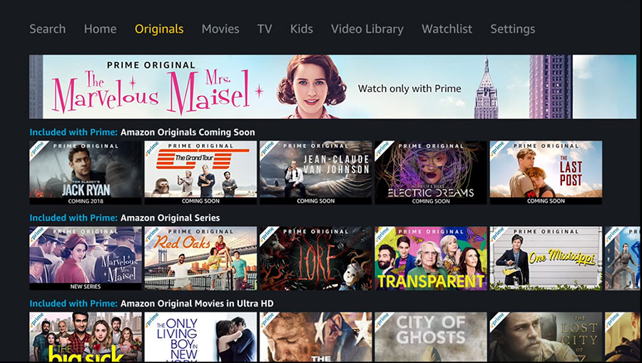
The way things behave is as much of a consideration as how they look. Take the recent launch of Amazon Prime Video on Apple TV. It’s more on the bespoke end of the spectrum. They keep the same basic principle of horizontal lists of landscape cards you navigate between – a commonly accepted standard it seems for TV services – however the size, positioning and behaviour of these varies from the native recommendations.

To pick on one tiny detail in the app: switching primary navigation tabs in Amazon Prime Video. If you’re going to have tabs, make them behave like tabs on the platform. On Apple TV the HIG suggests that simply moving the selection to a tab displays the content for that selection, Amazon requires an additional click to confirm the tab selection. The result of this is that users might be left hanging thinking that the app is just slow to respond, it might take them a while to realise they have to click (if they realise at all).

Primary navigation on Amazon Prime Video Apple TV app

Apple TV apps generally use sound effects as you move around the UI, including across the primary navigation tabs. The control mechanism of the remote control is remote – the sound is an additional reinforcing mechanism that confirms to users the action they made was registered. Amazon does not use any of these sound effects so users might have to concentrate that much more when using the UI to visually confirm the action they took registered and was as intended.

Going bespoke is fine, but making these kinds of adjustments to well-accepted behaviours on a platform is likely to cause frustration.


Lessons

If you have a mass market who are likely to use more than one platform to access your service, then ensure there is some consistency in the experience – mostly around the overall information architecture and primary navigation paradigm. Make it easy for users to move seamlessly between platforms as much as possible.

It makes sense to take into account platform guidelines or base interaction and behavioural consistency. People get used to using a device and if every service with an app on that device works completely differently, the friction when moving between apps is high. Go with the flow and be a good citizen of the platform where possible.

Avoid completely bespoke implementations that will confuse users and adhere to the base conventions so as not to create unexpected experiences on any given platform. It can be a tricky balance to strike.

When testing your designs it’s important not to test in isolation. Perform tests with users in a way that mirrors active use. Testing anything in isolation is never an accurate reflection of the real world. Your service is not the only reason any user owns a device that runs the platform your service operates within.


Design December 18th 2017

You might also be interested in...

  • Apple TV – our predictionsApple TV – our predictions There has been a lot of talk about what Apple might do in the TV space of late, again. There are rumors of a new device coming to market that will also come with a new SDK allowing developers to produce apps for the device much like […]
  • Apple iPod touch update at last, but…Apple iPod touch update at last, but… Apple press release Apple® today announced its 16GB iPod touch update is now available in vibrant colors and equipped with a 5 megapixel iSight® camera for just $199. The entire iPod touch lineup features the 5 megapixel iSight […]
  • Bad app citizensBad app citizens I saw a few posts circulating on twitter recently, regarding facebook and the size of its mobile app downloads, with users making comparisons to other apps. This got me thinking - as a user who has a lot of apps installed, how much […]

Product Design

The ‘Product’ is the website, service, application, interactive thing being worked on by the business. The practice of Product Design is similar in a lot of ways to UX Design. It involves the coming together of many specific design disciplines...

Call to action (CTA)

A call to action is a marketing term that refers to a prompt that invokes a response leading to a sale. When referring to a call to action (CTA) in the digital design world we usually mean the interactive element that leads to the next step in the experience - something that needs to be clicked or tapped.

User testing

User testing refers to a technique used in the design process to evaluate a product, feature or prototype with real users. There are several reasons why you might want to undergo usability testing, the most common is that it allows the design team to identify friction in a user experience they are designing, so that it can be addressed before being built or deployed.

WYSIWYG

WYSIWYG (pronounced WIZ-ee-wig) is an acronym for "What You See Is What You Get". It helps identify an an interface that allows user input resulting in an output that is rendered in a similar way. For example; a word processor application interface might resemble a piece of paper,so when printed the user can see how the output will appear.

Content Management System

A content management system (CMS) is an tool that allows a website editor/administrator to manage the content that is displayed. Websites are made of HTML and CSS to create pages. Pages can be hard-coded but would require technical development skills to make changes. A CMS usually allows a person without coding knowledge to amend existing and add new content to a website using a WYSIWYG interface.

Responsive Web Design

Responsive web design refers to a web page that dynamically adapts its layout to fit the size and orientation of the device on which it is viewed. A responsive design allows for a more optimised user experience across desktop and laptop computers as well as smartphones and tablets of varying sizes.

User Stories

User stories allow the functionality of a product or service to be expressed as written descriptions of an experience as seen from the users perspective. The writing of user stories creates a list of design and development tasks to complete in order to create any required functionality.

User Interface

A user interface (UI) is a conduit between human and computer interaction - the space where a user will interact with a computer or machine to complete tasks. The purpose of a UI is to enable a user to effectively control a computer or machine they are interacting with, and for feedback to be received in order to communicate effective completion of tasks.

Personas

A persona in UX Design is the characterisation of a user who represents a segment of your target audience. On a project you might create any number of personas to be representative of a range of user needs and desires. The solutions you design must answer these needs in order to deliver value to your target audience.

Card sorting

A great, reliable, inexpensive method for discovering patterns in how users would expect to find content or functionality. Card sorting is used to test the taxonomy of data with a group of subjects, usually to help inform the creation of the information architecture, user flow, or menu structure on a project.

Brainstorming

A technique used to generate ideas around a specific topic. Often done in groups, but can be done individuals. The process usually involves writing down all ideas around a topic onto paper, a whiteboard or stickies often implying some kind of association.

Minimum Viable Product

An MVP is a product that has the minimum set of features to prove the most essential hypothesis for a product. Businesses building a new product can create a Minimum Viable Product to prove that an idea is viable and warrants further investment. A further benefit being that the next stage of development can be informed by feedback obtained from testing that MVP.

Sitemap

A sitemap is a diagrammatic representation of a hierarchical system. It usually depicts the parent-sibling relationship between pages in a website, showing how sub pages might be arranged underneath their parent groupings. This arrangement forms a map of the site.

User journey

A user journey represents a sequence of events or experiences a user might encounter while using a product or service. A user journey can be mapped or designed to show the steps and choices presented as interactions, and the resulting actions.

Prototype

A prototype is draft representation built to test ideas for layout, behaviour and flow in a system. Prototypes are an indispensable tool for resolving a large number of potential issues in a concept or business before too many resources are deployed to put a design into production.

Wireframes

A Wireframe is a visual schematic that conveys a basic level of communication, structure and behaviour during the design of a system. Wireframes are low-fidelity designs that bypass including a detailed user interface or visual design, conveying just enough to get across the core idea.

Usability

To say something is usable is a qualitative statement about how easy that thing is to use. Usability is an assessment of how learnable a system is and how easy a user finds it to use. The usability of a system or product is a key factor in determining whether the user experience is a good one.

Information Architecture

Information architecture is the design and organisation of content, pages and data into a structure that aids users understanding of a system. A more organised system enables users to more easily find the information they require and complete the intended tasks.

UI Design

User Interface Design is the discipline of designing software interfaces for devices, ideally with a focus on maximising efficiency, responsiveness and aesthetics to foster a good user experience.

UX Design

The practice of User Experience (UX) Design is the coming together of many specific design related disciplines to improve the usability, responsiveness, uptake and aesthetics of a product or service.

User Experience

A general term that covers all aspects of a user's participation while engaging with something that has been designed. Usually when talking about User Experience in the digital design field it refers to the interactions, reactions, emotions and perceptions while using an app, service, website or product.