Bad app citizens

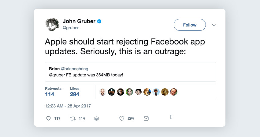
I saw a few posts circulating on twitter recently, regarding facebook and the size of its mobile app downloads, with users making comparisons to other apps.

John Gruber replying to Facebook app weight tweet

This got me thinking – as a user who has a lot of apps installed, how much bandwidth does my phone use to keep my apps updated?
App count gif

I might not be your average user. As a director of a UX Design agency I download a lot of apps. When new apps come out I often install them just to see how the interface looks or a specific onboarding experience is achieved. It’s the best way to learn. Consequently I have just over 250 apps on my device. That may sound like a lot, but check yourself – you might be surprised how many you have installed today.

One Friday I turned off auto-update for apps and let the update queue build up for a week. The results shocked me.

The rules:

  • Auto-update is off and no manual updates allowed until the weekly deadline
  • Every week at 5pm on a Friday I document the update list then start the update process
  • Do not uninstall any apps during this period
  • Any new apps installed were excluded from the count

I continued the experiment for a total of 6 weeks. I’ll caveat that the results would look quite different if I had 6 months of data, but ain’t nobody got time for that, and the top-20 worst offenders would likely not change positions. The results would look most different at the low end where most app publishers are largely doing things right.

After the first week I had 7.59GB of updates to install, spread across 67 apps – averaging 113MB per app.


After 6 weeks of documenting app update sizes, the results were as follows…

Most regular updaters

4 apps updated their app every single week:

  • Instagram
  • LinkedIn
  • Netflix
  • UberEats

10 apps updated 5/6 weeks
15 app updated 4/6 weeks
34 apps updated 3/6 weeks
31 apps updated 2/6 weeks
56 apps updated 1/6 weeks
102 did not update during the test period.

The top 10 bandwidth hogs

  1. Facebook 1.88GB
  2. LinkedIn 1.57GB
  3. Uber 1.35GB
  4. iTranslate 1.26GB
  5. Airbnb 1.12GB
  6. Facebook Messenger 1.05GB
  7. Peak Brain Training 0.96GB
  8. Facebook Pages manager 0.96GB
  9. Microsoft Outlook 0.88GB
  10. Google Sheets 0.84

Top 3 bandwidth hogs by company

  1. Google 5.64GB
  2. Facebook 4.77GB
  3. Microsoft 2.39GB


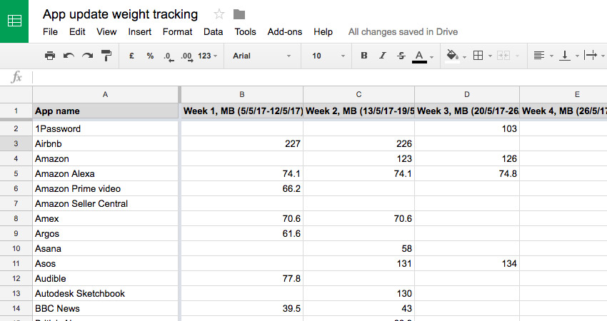
View my data here

Spreadsheet tracking app update weight over 6 weeks


There are apps here that didn’t update at all during this period, and you can’t judge all apps equally – some are exponentially more complicated than others and might have a large code base for good reason.

Also as a regular user I do appreciate that some companies have rapid iteration cycles, update regularly and fix bugs quickly. However at some point one does have to question whether a weekly release is always necessary, especially if your app weight is high. Many companies release updates based on their development sprint cycles, but they can wait – releasing every 3 or 4 sprints, or even waiting until there’s enough changes to warrant pushing an update.


To pick on one app and scale up the numbers

Let us assume LinkedIn is installed on 100 million devices (it states 50-100m on Android App Store alone), it updates every week with an average app update size of 261MB. Over the course of a year each user would download 13.5GB of updates for this one app alone, and across the 100 million users would equate to 162PB (Petabytes = 1,000 terabytes) of bandwidth for the planet to have an up to date professional networking mobile application. This seems somewhat excessive and I’m sure they could both optimise the app size and also not push quite so many minor and imperceptible changes on such a regular basis.

I don’t mean to single out LinkedIn too much, but there were one of the worst offenders in my data. The same could be said for 50 other apps on my phone.

Users bandwidth is not something to be treated lightly – all data is paid for, either on cellular or with wifi at home or at work. Data is not free and some companies play with it as if it is limitless. There is a cost, it’s just less tangible with digital products but it is a burden put on the user. The environmental impact alone due to energy and battery use must be large, especially when scaled across all apps globally.


If you don’t fix it, the platforms might

Clearly large apps sitting unused on device regularly updating in the background is an issue for many users – especially those who are constantly running into their device storage limits. Coming in iOS11 this year is a new feature that users can activate to automatically remove an app from your device if it sits unused. Your settings and data for that app persist, so if reinstalled you’ve not lost anything, but if enabled this feature will start automatically removing apps, freeing up space on users devices. We don’t yet know the logic for this algorithm but I can imagine it might take into account the app weight in it’s decision making process. Apple also launched App-Thinning via device target slicing and on-demand resources with iOS 9, but it’s hard to say how many developers go out of their way to use these techniques to improve their users experience with their apps.


Be a good app citizen

To be a good app citizen you must develop in a way that avoids bloated code where possible and only submit updates when there is clear user benefit to doing so. I know this sounds simple, and in practice is actually rather complicated, but the situation will only get worse unless it is addressed. We can’t rely on data network speed increasing and prices falling (although they hopefully will).

The best app citizens

Out of all the apps I captured during this period, there were some that seem to follow the rules of good-app citizenry. I’ve ignore apps that only updated once as it’s too shorter time scale to gauge if they do update with frequency or not. So focussing on the apps that updated twice, the smallest total downloads were:

  1. Just Press Record – 5.8MB
  2. Overcast – 37.4MB
  3. National Rail – 65.6MB
  4. Harvest – 66.6MB
  5. BBC News – 82.5MB

The first two were not surprising – indie apps by well known developers for doing things the right way. Just Press Record is a very simple app using external cloud storage systems, so the app weight can be light. Overcast is a podcast client – a more complex app, but the developer Marco Arment does things the right way; keeps his code base simple, efficient and with a minimal footprint. I was surprised to find the next three apps are made by larger companies. Despite my data set being relatively short it’s good to see large companies such as the BBC and National Rail keeping app weights low and updates frequent, but only as required.

When Every Interaction work on app projects, although we’re just designers and don’t do the development ourselves, we always emphasise the importance of being a good app citizen and are lucky enough to work with talented dev teams on our projects who recognise the importance of doing things well.

Make sure when you next work on an app, you do the same. If you’ve got a new app project and you’d like to speak to a user experience design agency about it, please get in touch.


Update 23rd June 2017
Several readers with more detailed knowledge wrote in to explain that App Thinning is indeed a thing widely used and the stated complete app bundle size is not actually what you download for each update. A communication issue perhaps Apple should address?

Matt Birchler‏ did some tests of his own showing across the apps highlight below the range in download size can vary between 47-80% of the full bundle size. So we should expect a fair degree of thinning to take place. Even still, halving some of these app sizes creates alarming app weights, and doesn’t change the fact that you should take these factors into consideration and update only when necessary. Be a good app citizen!
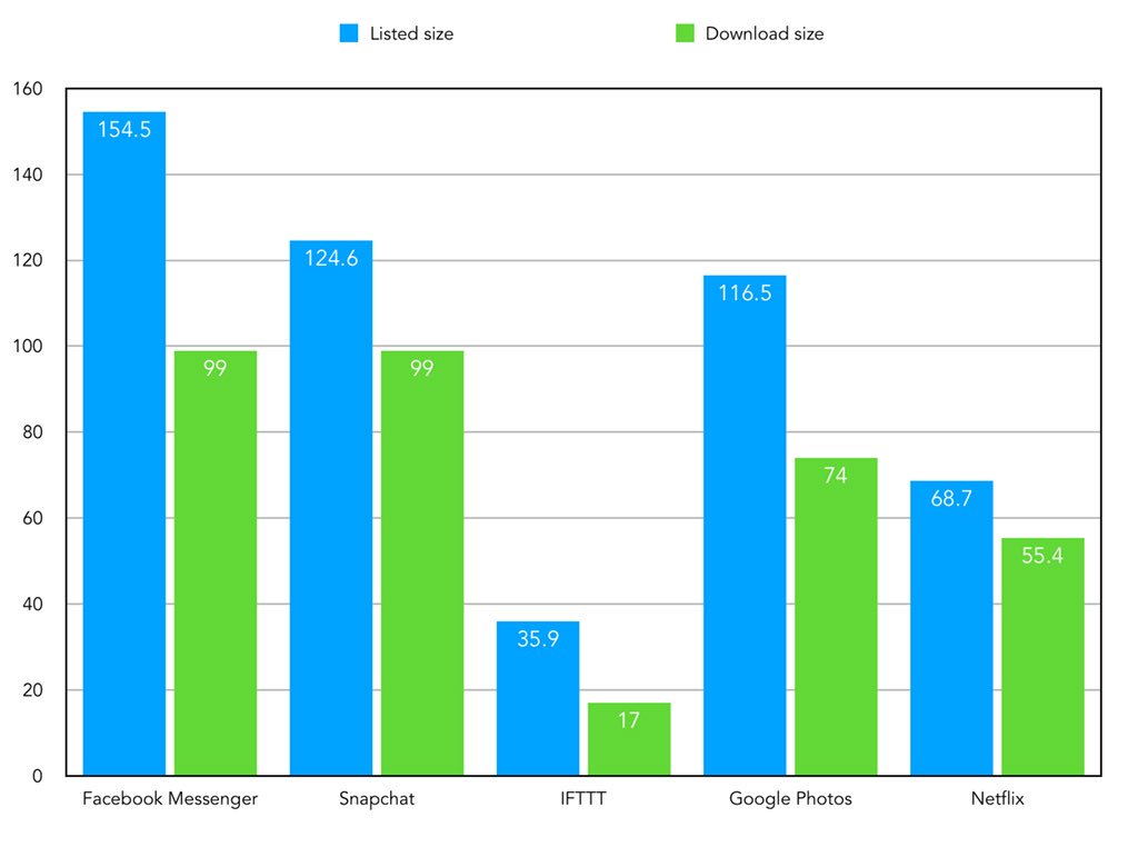

Credit to Matt Brichler for his research
 

Design June 22nd 2017

You might also be interested in...

  • User testing a product in MadagascarUser testing a product in Madagascar To some, Madagascar can conjure fairytale images of unspoiled landscapes filled with characters from Dreamworks movies. A lot has changed in the 88 million years since the island broke away from the prehistoric African subcontinent. In […]
  • Watchy – a doomed side projectWatchy – a doomed side project Following the release of the Apple Watch and having owned one since launch I quickly began sharing screenshots of my early experiences and finding the results a little lack-luster. A 312x390 px image (or 272x340 for 38mm) is placed in […]
  • Every Interaction Featured as Top UX Agency in UKEvery Interaction Featured as Top UX Agency in UK Top chefs and food critics say that the most memorable meals aren’t the ones that have long ingredient lists or are complicated to prepare. They’re the ones that include high-quality ingredients that let the natural flavours shine […]

Product Design

The ‘Product’ is the website, service, application, interactive thing being worked on by the business. The practice of Product Design is similar in a lot of ways to UX Design. It involves the coming together of many specific design disciplines...

Call to action (CTA)

A call to action is a marketing term that refers to a prompt that invokes a response leading to a sale. When referring to a call to action (CTA) in the digital design world we usually mean the interactive element that leads to the next step in the experience - something that needs to be clicked or tapped.

User testing

User testing refers to a technique used in the design process to evaluate a product, feature or prototype with real users. There are several reasons why you might want to undergo usability testing, the most common is that it allows the design team to identify friction in a user experience they are designing, so that it can be addressed before being built or deployed.

WYSIWYG

WYSIWYG (pronounced WIZ-ee-wig) is an acronym for "What You See Is What You Get". It helps identify an an interface that allows user input resulting in an output that is rendered in a similar way. For example; a word processor application interface might resemble a piece of paper,so when printed the user can see how the output will appear.

Content Management System

A content management system (CMS) is an tool that allows a website editor/administrator to manage the content that is displayed. Websites are made of HTML and CSS to create pages. Pages can be hard-coded but would require technical development skills to make changes. A CMS usually allows a person without coding knowledge to amend existing and add new content to a website using a WYSIWYG interface.

Responsive Web Design

Responsive web design refers to a web page that dynamically adapts its layout to fit the size and orientation of the device on which it is viewed. A responsive design allows for a more optimised user experience across desktop and laptop computers as well as smartphones and tablets of varying sizes.

User Stories

User stories allow the functionality of a product or service to be expressed as written descriptions of an experience as seen from the users perspective. The writing of user stories creates a list of design and development tasks to complete in order to create any required functionality.

User Interface

A user interface (UI) is a conduit between human and computer interaction - the space where a user will interact with a computer or machine to complete tasks. The purpose of a UI is to enable a user to effectively control a computer or machine they are interacting with, and for feedback to be received in order to communicate effective completion of tasks.

Personas

A persona in UX Design is the characterisation of a user who represents a segment of your target audience. On a project you might create any number of personas to be representative of a range of user needs and desires. The solutions you design must answer these needs in order to deliver value to your target audience.

Card sorting

A great, reliable, inexpensive method for discovering patterns in how users would expect to find content or functionality. Card sorting is used to test the taxonomy of data with a group of subjects, usually to help inform the creation of the information architecture, user flow, or menu structure on a project.

Brainstorming

A technique used to generate ideas around a specific topic. Often done in groups, but can be done individuals. The process usually involves writing down all ideas around a topic onto paper, a whiteboard or stickies often implying some kind of association.

Minimum Viable Product

An MVP is a product that has the minimum set of features to prove the most essential hypothesis for a product. Businesses building a new product can create a Minimum Viable Product to prove that an idea is viable and warrants further investment. A further benefit being that the next stage of development can be informed by feedback obtained from testing that MVP.

Sitemap

A sitemap is a diagrammatic representation of a hierarchical system. It usually depicts the parent-sibling relationship between pages in a website, showing how sub pages might be arranged underneath their parent groupings. This arrangement forms a map of the site.

User journey

A user journey represents a sequence of events or experiences a user might encounter while using a product or service. A user journey can be mapped or designed to show the steps and choices presented as interactions, and the resulting actions.

Prototype

A prototype is draft representation built to test ideas for layout, behaviour and flow in a system. Prototypes are an indispensable tool for resolving a large number of potential issues in a concept or business before too many resources are deployed to put a design into production.

Wireframes

A Wireframe is a visual schematic that conveys a basic level of communication, structure and behaviour during the design of a system. Wireframes are low-fidelity designs that bypass including a detailed user interface or visual design, conveying just enough to get across the core idea.

Usability

To say something is usable is a qualitative statement about how easy that thing is to use. Usability is an assessment of how learnable a system is and how easy a user finds it to use. The usability of a system or product is a key factor in determining whether the user experience is a good one.

Information Architecture

Information architecture is the design and organisation of content, pages and data into a structure that aids users understanding of a system. A more organised system enables users to more easily find the information they require and complete the intended tasks.

UI Design

User Interface Design is the discipline of designing software interfaces for devices, ideally with a focus on maximising efficiency, responsiveness and aesthetics to foster a good user experience.

UX Design

The practice of User Experience (UX) Design is the coming together of many specific design related disciplines to improve the usability, responsiveness, uptake and aesthetics of a product or service.

User Experience

A general term that covers all aspects of a user's participation while engaging with something that has been designed. Usually when talking about User Experience in the digital design field it refers to the interactions, reactions, emotions and perceptions while using an app, service, website or product.