Tweetbot iOS app review

Update – this is a review for tweetbot 2.0 released in Feb 2012, not the new iOS7 3.0. If thats what you’re after here is a perfectly good review. Our thoughts are that the new tweetbot is awesome and you should all download it now.


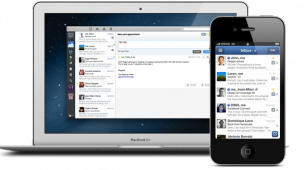
The new tweetbot iOS app was released the other day to much fanfare. Seeing as we recently reviewed the usability and features of the official twitter app we thought is prudent to run over what appears to be at a glance real contender to replace twitters own app as an everyday alternative. So follows our Tweetbot iOS app review.

Upon installing the app, assuming you already have twitter accounts connected to your device OS, you are presented the option of adding them automatically, saving time on the usual login authentication method.

Tweetbot tweet stream interface

Clearly aimed at the twitter power-user, this app is fully laden with an impressive array of features. At a glance these are:

  • Multiple account handling and switching (with independent settings)
  • Easy viewing of individual tweet conversations, replies and retweets
  • Filter timeline by your/others twitter lists
  • Readability switch for webpages viewed form links
  • Temporal or permanent timeline filtering of people, hashtags or clients
  • Wide array of service connections (image/vid uploads, URL shortening, text uploads, read later and sync) that are all very well integrated into the experience
  • Customisation of navigation, certain actions, retweet styles, display and post settings
  • Time-gap loading
  • Tweet translation (very useful!)
  • Draft tweet management


Clearly the team at Tapbots have put a lot of time and effort into understanding where the official twitter app falls short and created a very well produced, fast working, slick application.

The in-timeline preview of images is a particularly nice touch, as is the hold-press on certain elements to reveal a list of available actions. For example, holding a hashtag allows you to either filter-out all tweets using that hashtag from your stream, or compose a new tweet using it.

Tweetbot hashtag filtering

This mute filter feature enables blocking of a hashtag, a feature many twitter users will be glad to receive, allowing you to hide tweets from people watching #xfactor or tweeting about the #uksnow. Even better that you can set a time limit on these filters – useful if you want to block a certain person if they’re not using hashtags while tweeting like mad about X-Factor.

The number of ways to gain access to a tweets details seems a little over the top at times. Swiping right views a conversation or left views replies (the difference between which is marginal). You can also tap the tweet to access the actions bar and select the details (eye) icon, or you can double-tap the tweet to get to the same place (this view doesn’t load in the number of replies or retweets – requiring a further tap to see if anything lies behind these sections, something that the official twitter app does do). Clearly they’re trying to allow users to choose which route to the information they want to use, but sometimes too much choice can be a bad thing, and in this instance we feel the number of options is overkill and slows down the user experience.

tweetbot access details

Its technical abilities are hard to fault. But the sheer number of them makes the app feel too overcrowded at times. It would be nice to have a greater level of customisation on certain features (as they supply with the triple tap), such as setting your desired actions for the swipe left/right gestures.

The UI design is very much in the style of their other apps; a technical and industrial feel with high contrast and tactile, textured interface. If you’d asked us a year ago we probably might have preferred this styling to one presented more modestly and flat. But today our style preference here at Every Interaction is starting to sway more in the direction of a simplified UI, taking more cues form interfaces such as Windows metro and Flipboard. A trend in design Instagram made just today with their newly updated iOS app & UI.

The level of contrast and over-use of gradients and textures can be a little distracting in what is already a noisy display of data with tweets, avatars, actions and images. With tweetbot the eye has to work a little harder to scan the page and digest the information, than it does with the more subdued official twitter app UI – whose more tranquil tone aids tweet readability.

tweetbot official twitter comparison

One other thing I think the official twitter app does better is the new ‘connect’ (@) tab – blending mentions, new follows and favorites into a (still filterable to view only mentions) about you stream. Something we think Tweetbot would benefit form adding.

Apart from these few niggles we think the Tweetbot app is a superbly produced application and we believe we’ll be using it day-to-day over the native twitter app. The next killer feature that this (or any other twitter client app) might be adding to further increase its usefulness might be in-app camera tools. A twitter client that brings it’s photography power inline with apps like Path, or Instagram (which in it’s new form released today adds a Lux filter), providing direct access to filter styles and tilt-shifting will truly be a powerful player in the market.

Where we think Tapbots have missed the boat on this one is in making a more customised experience for the iPad app. As the official twitter client update has yet to appear for iPad, users are desperate for something better and the tweetbot app although good, feels just like the iPhone app scaled up, not utilising the additional screen real-estate as well as it has done. The composition screen takes over the interface and you cannot load links while you continue to scan your timeline. Many more improvement opportunities available here, but we’re thankful to have an alternative to the now old and feature poor feeling official twitter iPad app. Annoyingly tweetbot is not a universal app, making them separate purchases – surely a tactical decision to maximise app revenue, but one we’ll let slide as these things are not cheap to produce and it is very well produced and worth paying for, even twice.

Tweetbot iPad app UI

Have you tried Tweetbot? What in particular do you like about it’s features and UI, and what might you change?


Design Review Technology February 11th 2012

You might also be interested in...

  • Sparrow mail app review for iPhoneSparrow mail app review for iPhone Email is inherently personal and the way people manage it is personal too. Some are super-organisers; filing everything away into relevant folders (or tags), keeping a near-empty inbox with a zero-unread count. Others let their inbox fill […]
  • Every Interaction Featured as Top UX Agency in UKEvery Interaction Featured as Top UX Agency in UK Top chefs and food critics say that the most memorable meals aren’t the ones that have long ingredient lists or are complicated to prepare. They’re the ones that include high-quality ingredients that let the natural flavours shine […]
  • Bad app citizensBad app citizens I saw a few posts circulating on twitter recently, regarding facebook and the size of its mobile app downloads, with users making comparisons to other apps. This got me thinking - as a user who has a lot of apps installed, how much […]

Product Design

The ‘Product’ is the website, service, application, interactive thing being worked on by the business. The practice of Product Design is similar in a lot of ways to UX Design. It involves the coming together of many specific design disciplines...

Call to action (CTA)

A call to action is a marketing term that refers to a prompt that invokes a response leading to a sale. When referring to a call to action (CTA) in the digital design world we usually mean the interactive element that leads to the next step in the experience - something that needs to be clicked or tapped.

User testing

User testing refers to a technique used in the design process to evaluate a product, feature or prototype with real users. There are several reasons why you might want to undergo usability testing, the most common is that it allows the design team to identify friction in a user experience they are designing, so that it can be addressed before being built or deployed.

WYSIWYG

WYSIWYG (pronounced WIZ-ee-wig) is an acronym for "What You See Is What You Get". It helps identify an an interface that allows user input resulting in an output that is rendered in a similar way. For example; a word processor application interface might resemble a piece of paper,so when printed the user can see how the output will appear.

Content Management System

A content management system (CMS) is an tool that allows a website editor/administrator to manage the content that is displayed. Websites are made of HTML and CSS to create pages. Pages can be hard-coded but would require technical development skills to make changes. A CMS usually allows a person without coding knowledge to amend existing and add new content to a website using a WYSIWYG interface.

Responsive Web Design

Responsive web design refers to a web page that dynamically adapts its layout to fit the size and orientation of the device on which it is viewed. A responsive design allows for a more optimised user experience across desktop and laptop computers as well as smartphones and tablets of varying sizes.

User Stories

User stories allow the functionality of a product or service to be expressed as written descriptions of an experience as seen from the users perspective. The writing of user stories creates a list of design and development tasks to complete in order to create any required functionality.

User Interface

A user interface (UI) is a conduit between human and computer interaction - the space where a user will interact with a computer or machine to complete tasks. The purpose of a UI is to enable a user to effectively control a computer or machine they are interacting with, and for feedback to be received in order to communicate effective completion of tasks.

Personas

A persona in UX Design is the characterisation of a user who represents a segment of your target audience. On a project you might create any number of personas to be representative of a range of user needs and desires. The solutions you design must answer these needs in order to deliver value to your target audience.

Card sorting

A great, reliable, inexpensive method for discovering patterns in how users would expect to find content or functionality. Card sorting is used to test the taxonomy of data with a group of subjects, usually to help inform the creation of the information architecture, user flow, or menu structure on a project.

Brainstorming

A technique used to generate ideas around a specific topic. Often done in groups, but can be done individuals. The process usually involves writing down all ideas around a topic onto paper, a whiteboard or stickies often implying some kind of association.

Minimum Viable Product

An MVP is a product that has the minimum set of features to prove the most essential hypothesis for a product. Businesses building a new product can create a Minimum Viable Product to prove that an idea is viable and warrants further investment. A further benefit being that the next stage of development can be informed by feedback obtained from testing that MVP.

Sitemap

A sitemap is a diagrammatic representation of a hierarchical system. It usually depicts the parent-sibling relationship between pages in a website, showing how sub pages might be arranged underneath their parent groupings. This arrangement forms a map of the site.

User journey

A user journey represents a sequence of events or experiences a user might encounter while using a product or service. A user journey can be mapped or designed to show the steps and choices presented as interactions, and the resulting actions.

Prototype

A prototype is draft representation built to test ideas for layout, behaviour and flow in a system. Prototypes are an indispensable tool for resolving a large number of potential issues in a concept or business before too many resources are deployed to put a design into production.

Wireframes

A Wireframe is a visual schematic that conveys a basic level of communication, structure and behaviour during the design of a system. Wireframes are low-fidelity designs that bypass including a detailed user interface or visual design, conveying just enough to get across the core idea.

Usability

To say something is usable is a qualitative statement about how easy that thing is to use. Usability is an assessment of how learnable a system is and how easy a user finds it to use. The usability of a system or product is a key factor in determining whether the user experience is a good one.

Information Architecture

Information architecture is the design and organisation of content, pages and data into a structure that aids users understanding of a system. A more organised system enables users to more easily find the information they require and complete the intended tasks.

UI Design

User Interface Design is the discipline of designing software interfaces for devices, ideally with a focus on maximising efficiency, responsiveness and aesthetics to foster a good user experience.

UX Design

The practice of User Experience (UX) Design is the coming together of many specific design related disciplines to improve the usability, responsiveness, uptake and aesthetics of a product or service.

User Experience

A general term that covers all aspects of a user's participation while engaging with something that has been designed. Usually when talking about User Experience in the digital design field it refers to the interactions, reactions, emotions and perceptions while using an app, service, website or product.