Cyber security campaign gone wrong

The Home Office here in the UK recently launched a new campaign to raise awareness about cyber security for both individuals and businesses called Be Cyber Streetwise. The campaign consisted of print ads and a website which focussed on a juvenile cartoon concept of several urban scenes depicting parody scenes relating to key points about protecting your data. Personally I think the cartoon approach was not a suitable style for a serious campaign like this; making it light hearted doesn’t help soften the topic in a constructive way. Visual implementation aside the illustrations have been well crafted by Steve May and the analogies will no be lost on anyone despite the approach.

cyberstreetwise poster

Regardless of how well the print campaign works, the online implementation of this campaign is inexcusably bad and both M&C Saatchi and the Office of Cyber Security and Information team responsible for the project should be ashamed at wasting tax payers money so.

View the campaign site.


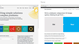
This is clearly a campaign that has been conceived in print and the idea adapted for web. Such an approach would be considered a bad idea today regardless of the campaign topic, but for a campaign that focusses on an online activity? Insane.

It’s such a shame as the message is an important one (categorised as ‘National Security’ on their website) and it’s meaning and message is all but lost in the online implementation. The illustrations although attention grabbing and are interesting analogies in static print form, take on a juvenile childish approach when animated that feel patronising and detract from the serious context of the campaign. It feels more Sesame Street than Cyber street.

To point out just a few of the major things that are wrong with this campaign site…

The navigation is all wrong. They essentially made several sites and made the user decide which is relevant to them. The first interaction on the site, before you can see anything about the campaign is a choice asking you which vertical you fit into.

Cyber Streetwise website entry

Such a move will instantly lose a large number of visitors before you have communicated a single message. The correct approach would be to have a global message and segment the content with the experience for those who decide to delve in deeper. The message is essentially the same for either home or business users, only the content specifics need adjusting once a vertical has been selected. If the campaign approach does not support this, the campaign concept needs adjusting.

The second major mistake is that the content is not easily browsable, instead hidden behind random signposts, animations, buildings and characters.

Cyber Streetwise main interface

It feels more like a children’s game rather than an informative website, and the animated, illustrative design choice does not help this deficit. There is an ‘index’ style navigation hidden behind a newspaper in the bottom left, but this seems it was thrown in as a secondary thought rather than acting as a serious form of primary navigation. It’s not searchable. They’ve used an exploratory interface for something that is very factual and only a very small subset of the content will be relevant to any one individual – if I’m looking for something specific (which most users probably will be) it’s difficult to find what you’re looking for.

The final major issue l’ll go into today is that the site does not work particularly well responsively or accessibly. Any site you need to provide a completely separate accessible version of today has not been well conceived. Although this site technically works on smaller screen devices, it does not work well and the concept and interface become even more cumbersome and hard to use without the additional screen real estate required to support a scrolling UI like this, or the rollovers that come with using a mouse. In short, this a very bad choice for a modern website, especially a Government one. It feels more like an overblown flash site from 1998.

There are many more things wrong with this campaign and website that are too numerous to list in this post.

All in all this is a bad job and considering M&C Saatchi had a budget of £4m to deliver this campaign, they could have done a lot better. I believe these mistakes often happen because a single full service agency is appointed to deliver the project across all media. To get one agency to cover all bases across concept, print and web will inevitably end badly in at least one area, it’s just a natural side effect of full service. If the government really wants higher quality work and to support smaller businesses they should work harder to find smaller specialist agencies who can work together to achieve a higher quality end result. It will take more effort then manage, but they could easily hire a dedicated PM to handle this on their behalf with this kind of budget and still save money.  Using full service agencies is the easy/lazy way out. Given a little help I hope they make better choices on future projects.

Thumbs down to James Brokenshire MP and his department.


Creative Review April 4th 2014

You might also be interested in...

  • Stuck to Unstuck; getting our own website design project movingStuck to Unstuck; getting our own website design project moving Working on your own website can be one of the hardest things for a design agency to do. I even recorded a podcast about how difficult this can be. Our old site was showing its age and as a business we’d moved on - we needed something that […]
  • Every Interaction Featured as Top UX Agency in UKEvery Interaction Featured as Top UX Agency in UK Top chefs and food critics say that the most memorable meals aren’t the ones that have long ingredient lists or are complicated to prepare. They’re the ones that include high-quality ingredients that let the natural flavours shine […]
  • Every Interaction named market leader in UI/UXEvery Interaction named market leader in UI/UX We’re very pleased to announce that we have been named a market leader in providing User Experience & Interface Design by the team over at clutch.co. On their leaders matrix they shown us as being the most market-leading with high […]

Product Design

The ‘Product’ is the website, service, application, interactive thing being worked on by the business. The practice of Product Design is similar in a lot of ways to UX Design. It involves the coming together of many specific design disciplines...

Call to action (CTA)

A call to action is a marketing term that refers to a prompt that invokes a response leading to a sale. When referring to a call to action (CTA) in the digital design world we usually mean the interactive element that leads to the next step in the experience - something that needs to be clicked or tapped.

User testing

User testing refers to a technique used in the design process to evaluate a product, feature or prototype with real users. There are several reasons why you might want to undergo usability testing, the most common is that it allows the design team to identify friction in a user experience they are designing, so that it can be addressed before being built or deployed.

WYSIWYG

WYSIWYG (pronounced WIZ-ee-wig) is an acronym for "What You See Is What You Get". It helps identify an an interface that allows user input resulting in an output that is rendered in a similar way. For example; a word processor application interface might resemble a piece of paper,so when printed the user can see how the output will appear.

Content Management System

A content management system (CMS) is an tool that allows a website editor/administrator to manage the content that is displayed. Websites are made of HTML and CSS to create pages. Pages can be hard-coded but would require technical development skills to make changes. A CMS usually allows a person without coding knowledge to amend existing and add new content to a website using a WYSIWYG interface.

Responsive Web Design

Responsive web design refers to a web page that dynamically adapts its layout to fit the size and orientation of the device on which it is viewed. A responsive design allows for a more optimised user experience across desktop and laptop computers as well as smartphones and tablets of varying sizes.

User Stories

User stories allow the functionality of a product or service to be expressed as written descriptions of an experience as seen from the users perspective. The writing of user stories creates a list of design and development tasks to complete in order to create any required functionality.

User Interface

A user interface (UI) is a conduit between human and computer interaction - the space where a user will interact with a computer or machine to complete tasks. The purpose of a UI is to enable a user to effectively control a computer or machine they are interacting with, and for feedback to be received in order to communicate effective completion of tasks.

Personas

A persona in UX Design is the characterisation of a user who represents a segment of your target audience. On a project you might create any number of personas to be representative of a range of user needs and desires. The solutions you design must answer these needs in order to deliver value to your target audience.

Card sorting

A great, reliable, inexpensive method for discovering patterns in how users would expect to find content or functionality. Card sorting is used to test the taxonomy of data with a group of subjects, usually to help inform the creation of the information architecture, user flow, or menu structure on a project.

Brainstorming

A technique used to generate ideas around a specific topic. Often done in groups, but can be done individuals. The process usually involves writing down all ideas around a topic onto paper, a whiteboard or stickies often implying some kind of association.

Minimum Viable Product

An MVP is a product that has the minimum set of features to prove the most essential hypothesis for a product. Businesses building a new product can create a Minimum Viable Product to prove that an idea is viable and warrants further investment. A further benefit being that the next stage of development can be informed by feedback obtained from testing that MVP.

Sitemap

A sitemap is a diagrammatic representation of a hierarchical system. It usually depicts the parent-sibling relationship between pages in a website, showing how sub pages might be arranged underneath their parent groupings. This arrangement forms a map of the site.

User journey

A user journey represents a sequence of events or experiences a user might encounter while using a product or service. A user journey can be mapped or designed to show the steps and choices presented as interactions, and the resulting actions.

Prototype

A prototype is draft representation built to test ideas for layout, behaviour and flow in a system. Prototypes are an indispensable tool for resolving a large number of potential issues in a concept or business before too many resources are deployed to put a design into production.

Wireframes

A Wireframe is a visual schematic that conveys a basic level of communication, structure and behaviour during the design of a system. Wireframes are low-fidelity designs that bypass including a detailed user interface or visual design, conveying just enough to get across the core idea.

Usability

To say something is usable is a qualitative statement about how easy that thing is to use. Usability is an assessment of how learnable a system is and how easy a user finds it to use. The usability of a system or product is a key factor in determining whether the user experience is a good one.

Information Architecture

Information architecture is the design and organisation of content, pages and data into a structure that aids users understanding of a system. A more organised system enables users to more easily find the information they require and complete the intended tasks.

UI Design

User Interface Design is the discipline of designing software interfaces for devices, ideally with a focus on maximising efficiency, responsiveness and aesthetics to foster a good user experience.

UX Design

The practice of User Experience (UX) Design is the coming together of many specific design related disciplines to improve the usability, responsiveness, uptake and aesthetics of a product or service.

User Experience

A general term that covers all aspects of a user's participation while engaging with something that has been designed. Usually when talking about User Experience in the digital design field it refers to the interactions, reactions, emotions and perceptions while using an app, service, website or product.