Working on your own website can be one of the hardest things for a design agency to do. I even recorded a podcast about how difficult this can be. Our old site was showing its age and as a business we’d moved on – we needed something that better represented who we are and what we do today. We tried kickstarting the process several times over the past year or two and fell into the trap of always beginning with the case studies. We felt that we lacked the ability to tell our own story. On each attempt we always stalled as we lacked a cohesive communication strategy for how to write about ourselves.
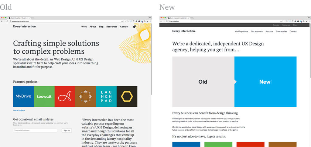
Following research into our analytics it was clear that users were looking for more content about us, who we are and how we work. Our old site had a major deficit here, so we came to realise that before we can figure out how we should talk about our work, we should first figure out how we talk about ourselves. Talking about the work should then follow naturally. We needed to make the written content – rather than the case studies – our primary focus.
We collected notes accumulated over time from various team members but always seemed to fail at bringing them together into a unified message that we felt reflected us. We lacked the objectivity to take a step back and write about ourselves in a way that felt approachable and successfully communicated us and our values to potential clients. As part of the UX process we’re used to helping craft copy to reflect other businesses every day, but we were too close to this problem to think objectively about it. So we enlisted the help of Anna from InkSpiller.
Anna ran a workshop that helped us establish our core values, tone of voice and do a bit of soul searching about what Every Interaction stands for. Using this and nuggets from our various past notes she began to construct a new brand communication strategy that lead to the 1st draft of a new copy doc.
We didn’t want to put any constraints on the exercise by writing for a predetermined sitemap, instead we wanted the message to be correct and backwards engineer a set of pages from the new copy. Anna set about writing in a web-friendly way, and through several iterations with us built up a version of the content we all felt gave an honest and fresh perspective on Every Interaction, what we do and what working with us might be like.
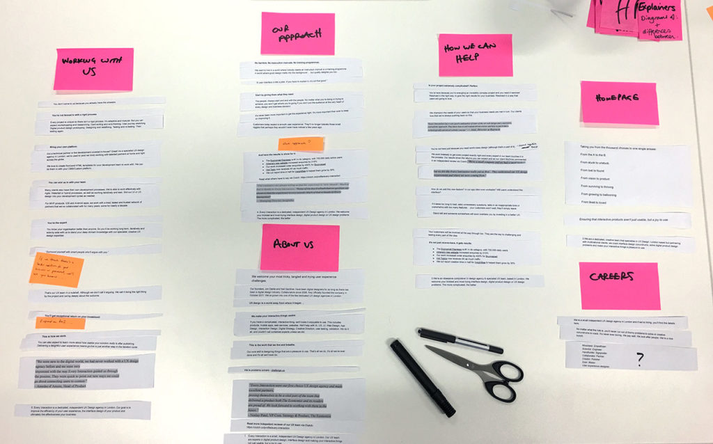
Once we felt the copy was right, we took Anna’s words and put them through a card-sorting exercise. As natural groupings of content began to distill, labels started to form that gave us the shape of our new sitemap. This was a particularly useful exercise as it made us realise we had 3 distinct ‘about’ sections that we wanted to include; Working with us / Our approach / About us. We created a new sitemap and wireframes to test the updated navigation structure and page content in situ before starting on the design.
When we started this process we were thinking of replacing the entire website anew. We had grand plans for new case studies and an updated resources section, all built using a static site generator rather than wordpress. However we knew that creating an entirely new website was no small task, and fitting it around client work may take many months, or longer. We didn’t want this great new copy to sit unused for all this time, so instead we decided to make an interim update to the existing site.
Without replacing the CMS or making too many changes to the templates we began work on an updated design that allowed for the new content to be put to use and give our site a slightly fresher look. This involved a navigation update, new fonts, a new template or two and subtle tweaks to existing templates to bring it all in line.
The case studies have remained largely unchanged, but as a stopgap before we have time to replace them we decided to start writing project stories on our blog. We link to these from the case study pages and they do a good enough job for now of fixing our case studies biggest shortcomings. We’ve put these live for both LooWatt and Barrocal so far and intend to extend these over time for other projects.
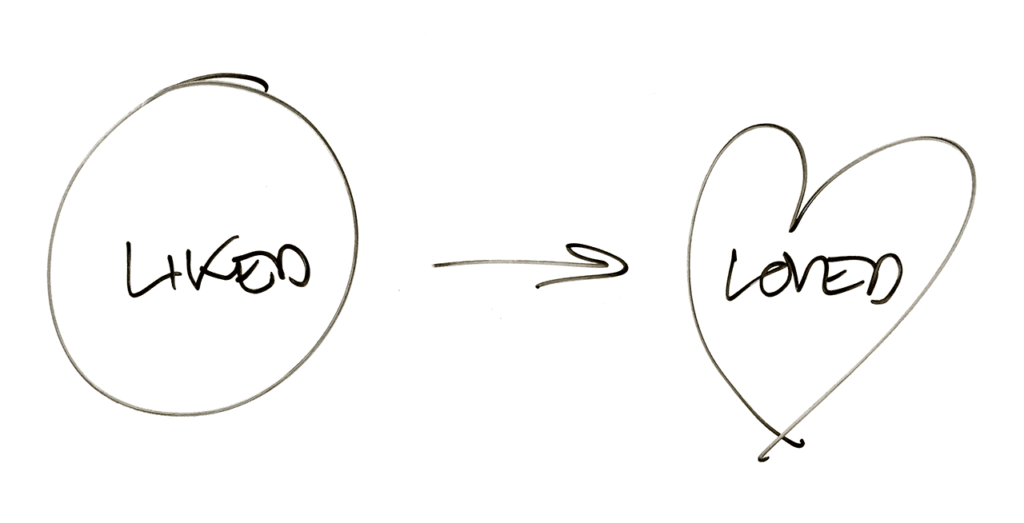
Part of the challenge was making the homepage feel more alive, and adding something that instantly communicated what working with Every Interaction is like in a fun and engaging way. It started with a definition that came out of a mentoring session of what we think UX is and how we use it. Distilling it to it’s most simple representation UX is about getting you from A to B. In this visualisation UX is the ‘to’ or an arrow from the beginning to end point – it’s the journey, and we wanted to express that working with us and bringing design thinking to your organisation is about going on this journey. We liked this concept and extended it into a range of statements, starting with A – B. The final result is the animated panel on the homepage you see today.
Overall we’re very pleased with the results and exceptionally glad we took a content-first approach and enlisted the help of a specialist copywriter to help get us there. We plan to treat other sections of the site as future micro/side projects that we can continue to work on and evolve over time, and hopefully start to think of our own site as a ongoing and iterative project rather than something we let linger and grow to dislike.
We’d very much like to hear your thoughts on the update – drop us a line.

