We’re living in the age of mobile apps. As per Statista, as of March 2017, Apple and Google app stores together had over 5 million apps. Gartner predicts mobile app downloads to generate an income of $77 billion in 2017. However, a report by Localytics highlights some troubling statistics about app engagement. The report found that-
- 24% of users abandoned an app after using it just one time.
- Only 37% of users use a particular app 11 or more times
While there are many contributory factors behind the abandonment of a mobile app like usefulness of the app, features, onboarding, engagement etc., but studies suggests that failure to create a winning first impression and user experiences are a major reason behind failure of apps. Design is one of the major element of impressing first time users and providing great experience.
So how to design to impress your users?
Embrace Minimalist Design. Why? We’ll come to it later but before let’s understand how mobile is different from desktop or a laptop from a design point of view-
- Mobile app usage is different- A mobile user’s major focus is on completion of tasks. We use mobile apps on the go-while walking, talking and even during our morning jogs.
- Mobile screens are smaller- Unlike desktops and laptops where you have some consistency, each model of mobile phone varies in screen size.
- Touch, not click- Unlike desktops where you click to next action, on mobile phones people touch for next action. Also mobile is not typing friendly.
- Context Dependency- Mobile phones don’t have an intermediary like a mouse or trackpad. The app needs to be easy to use for people with small and big hands, at home or outside, in dark and in light.
Now, let’s come to why a minimalist UI works better for mobile. Nick Babich, in his article ‘The Art of Minimalism in Mobile App UI Design’ writes-
“Minimalism is a perfect marriage of form and function. It’s greatest strength is clarity of form — clean lines, generous whitespace, and minimal graphical elements brings simplicity to even the most confounding subject matter. That is, of course, if it’s used effectively.”
A minimalist UI design for mobile app does wonders to user experience because-
- The screen is nice and tidy without extraneous details
- As it advocates using less elements, each element has it’s important purpose
- Easy to onboard and navigate without help
- Easy to uses app boosts user engagement
How to design minimally?
1. Plan Well
When ‘less is more’ you need to plan each element-color, contrast, space, typography etc., well. Every element needs to be well thought. Do you need it? Can your design live without it? Think on both sides and then go ahead. Think with the end result- engaging your user, helping them achieve their goal easily and quickly- in mind.
2. Choose Right Color Palette
In minimalist mobile app designs, colors assume great significance. Color is a great way to convey vitality, communicate, give feedback and help people visualize data. Choosing right color palette is essential, however, it is important to keep it to minimum. You can pick any color you prefer but use colors that are great contrast to each other like grey and white, yellow and black, blue and white etc. Use color tools to test your colors. You can start with using:
- Monochromatic color schemes wherein you use different tints and shades of a single color. Blue and Green are good colors for monochromatic hues as these are very soothing to eyes.
- Analogous color schemes wherein you pick 3 colors that are next to each other on color wheel. Calm, a meditation app, uses analogous colors of blue to create a calm and serene environment for its users.
- Complementary color schemes are great to make key elements in your screen stand out. Complementary colors are situated on the opposite sides in color wheel.
3. Use Typography To Advantage
How to make the most of typography in minimalist mobile app design? The answer lies in understanding typeface and how people read on small screens. There are many considerations in deciding typography for a mobile app are like font type, font size, space and line length.
- Fonts: Mobile platforms have their own default fonts like San Francisco (SF) is the system typeface in iOS whereas Android supports Roboto style. However, you can also use your custom fonts provided the platform supports it. However, unless your app has a compelling need for a custom font, such as branding, it’s best to opt for system fonts.
- Font Size: The size of your font is important as it not only adds to your design but also affects readability of the user. A good starting point in selecting font size could be guidelines from Apple and Google. Apple recommends a minimum of 11pt font size whereas it is 12sp for Android.
- Space: Good space between lines not only improves the readability of your text but also add beauty to your content. So give at least 10 to 20% spacing between your texts.
- Line length: The number of characters including spaces that are displayed on a single line is called line length. For desktops, the line length is mostly kept at 60 characters. A longer line length will push text beyond the screen boundaries and at the same time make readability poor. A length of 30 characters works well for mobile apps.
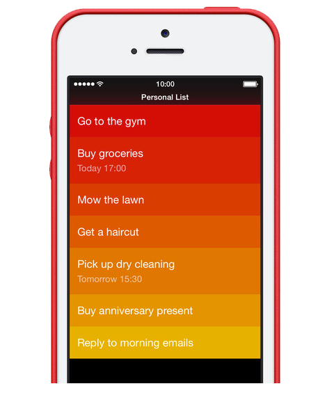
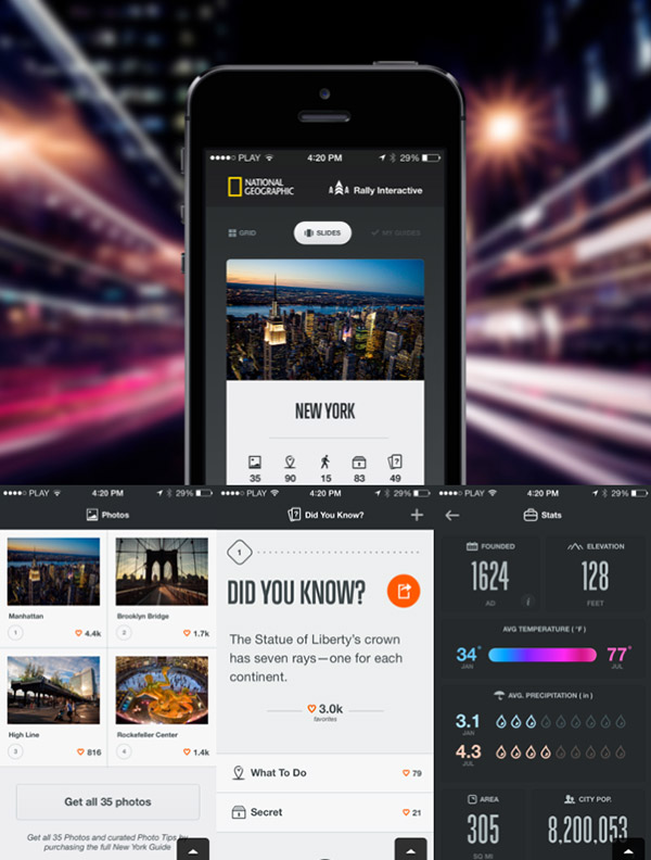
Using several different typefaces can make your app seem fragmented and sloppy. So use one typeface with minimum font variants and sizes. If done properly, typography can be the design like in this app-
4. The Importance of White Space:
It is a cornerstone of any good design. It has many benefits when done right. It make you design look neat, fresh and soothing. Also it inherently attracts user’s attention to important elements in the screen. In our previous post- White space in UI design, we have discussed some of the best practices in using white space. Here are some tips to keep in mind while using white space for your app:
- Practice 15 points rule: Pioneered by Designer Paul Boag, it recommends limiting a page to 15 points of attention. He says, each item you add to the page costs 1 point. If one screen element is more important than another you need to assign it additional points to make it stand out.
- One action per screen: Each screen of your app should just provide one action for the user. This will not only keep your design good but will also help user in understanding your app and using it fast.
- Use whitespace as divider: You can use whitespace to divide various elements in a screen. For example, while designing a product/service listing page, you use whitespace to divide various product types.
5. Use Images & Icons Strategically:
Use images only when it is necessary and serves a specific purpose. You can use a image to convey a message better or if it helps you replace texts in your screen.
Use icons strategically to not only replace content but also for navigation to other screens and highlight active/inactive state. Stroke and filled icons are very popular on mobile with stroke icon representing inactive state and filled icons the active state. Whichever icons you choose, always ensure-
- Simple and Schematic
- Icons are recognizable
- Icons are memorable
Final Thoughts:
As Antoine de Saint-Exupéry famously said: “Perfection is achieved when there is nothing left to take away.” Minimalist design works best on that philosophy. However, our goal should be creating more than a minimalist mobile app design but to create seamless user interaction and memorable user experiences. That’s what will help the app become a success. Begin with the end goal in mind and with some efforts you will get your app design right!