Responsive Web Design London
Responsive web design is at the core of all the web work we produce at Every Interaction.
Responsive web design has been an important facet of all web design since smart phone screens were able to display and allow interaction with the ‘full internet’ on their immersive touch screens. More people than ever use their devices to access the web and in some verticals (such as e-commerce) the percentage of users on mobile has passed the 50% barrier and is continuing to grow.
Because of this all web work we do today that’s consumer facing is responsive web design (RWD). The flexible websites we design are programmed to fit any browser width, including desktops, laptops, tablets or phones. In the multi-device world we live in, we need to ensure users have an optimal experience regardless of the device they use to access it.
Day by day, the number of devices, platforms, and browsers that need to work with your site grows. Responsive web design represents a fundamental shift in how we’ll build websites for the decade to come.
~ Jeffrey Veen
 Responsive web design isn’t the right solution in every scenario, but it is for nearly every scenario. For most circumstances the single codebase required means less time effort and cost to put live and maintain than creating separate sites or different target widths.
Responsive web design is about more than just squashing the content to fit into a smaller screen. If responsive web design is to be successful the correct thinking must be employed from the outset of the project and the entire UX of the site/service must be carefully considered at all widths to ensure a successful implementation.
 How We Work
Responsive web design can be difficult to communicate effectively to an external development team in the build phase of a project, so we usually prefer the front-end code to be something that we deliver. But we are flexible and in the cases where you have front-end build covered we always offer all resources required for briefing and thorough QA processes to ensure the final output is as flawless as possible.
 Our USPs & Key Benefits
At Every Interaction, our designers are experienced and at the cutting edge of responsive web design. We understand that the user experience is rarely, if ever, limited to one device, and positive UX across all devices adds to the value of your site/service. It helps to engage potential customers, facilitate access to your message, and increase the efficiency of your online presence.
 Our Process
We can work alongside your team on existing projects or create responsive designs from scratch. We know that it’s not always possible to have an in-house team to realise your vision, whatever stage of the process you’re working on. That’s why Every Interaction has a flexible and scalable design team that’s ready to take on your project at any stage of its development.
Recent projects with Responsive Web Design
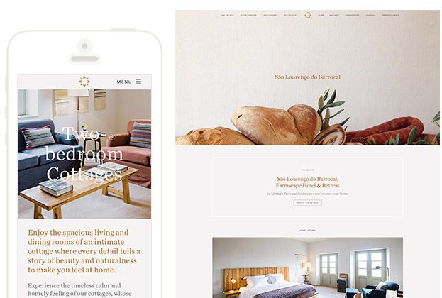
Nearly every project we done for the past few years have been responsive, and it has changed the way we work at Every Interaction for the better. Below are a few examples of responsive design we’re particularly proud of. View all Responsive Web Design projects.

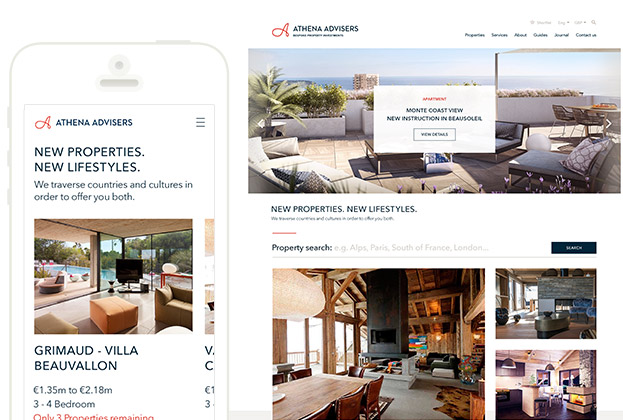
We delivered a new experience and platform to align with a re-brand and a new strategy. The site combines a portfolio with engaging destination guides and content on property investment. Built on a custom Zend Framework CMS this update has given the business the tools they need to grow their business for many year ahead.
Other services you may be interested in
Contact us about your project
Thank you for your enquiry.
