As a designer of numerous web and mobile applications that require different types of data to be summarized and presented in the clearest possible way, I’ve spent more than 2,000 hours designing in Sketch since making the switch from Adobe Fireworks. Most of that time was spent messing around with the visuals of tables, line charts, pie charts and other graphs.
In this article I want to share my insights and some time saving techniques for use when designing data-heavy interfaces with Sketch.
Creating Pie & Donut Charts
One of the most common chart type used to illustrate numerical proportions is the pie chart. While simple in theory, it is sometimes a bit tricky to design, especially when real-life data needs to be used. I currently use two different techniques, each of which has its advantages.
Segmented Circles Plugin
The first technique requires the amazing Sketch Plugin “Segmented Circles” built by German Bauer. It is, by far, the most advanced plugin I have come across for generating different types of pie charts within seconds. Since all segment values are entered into a single text field, one can simply copy and paste real data directly, e.g., from Excel.

Abusing Angular Gradients
I have to admit that this technique is a bit messy – but it’s incredibly useful when you need many pie charts of the same style and want to change the values of the slices quickly without the need to redraw the entire chart.
Simply add a circle and apply an angular gradient as the background. Then add two hard color-stops for each segment and align them accordingly. This is great for quickly duplicating charts, as you can simply copy and paste the style onto each circle and then adjust the color stops.
Creating Line Charts
Line charts are involved in pretty much any analytics-related interface design, as they are one of the best available options for presenting a series of data points. They can, however, be beasts to design and maintain, as detailed line charts can easily grow to hundreds of layers and groups. In order to keep all these layers structured – including the line grid, legends, marker points and graphs – organization and simplification is key.
Use Numbers or Excel
This is amazing since it saves an enormous amount of time “faking“ a nice looking graph within Sketch and allows you to design with real data. Just use your favorite spreadsheet application to create a line chart and export it as a PDF. When opening the PDF with Sketch, you can select each individual element of the chart, since they are all exported as vector graphics and organized in layer groups.
– dropping a PDF exported by Numbers into Sketch.
If you don’t have a set of data ready to create a diagram within Numbers or Excel, simply generate a random set of numbers using the RANDBETWEEN function.
Create symbols for points and shared styles for lines
Since the most annoying part of customizing line charts has always been finding and selecting the correct layers to adjust, it’s a good idea to automize that step as much as possible by creating symbols for each variation of data point as well as shared styles for each colored line. In this way, you can update aspects like color and border width for all charts in the design simply by updating the symbol or shared style.
Make it resizable!
Since Sketch version 39, it has been possible to create actual responsive designs that scale up and down like magic, without distorted elements. Applying resizing rules to the elements of a line chart is a good idea when there’s a possibility that the dimensions of the parent container might some day change.
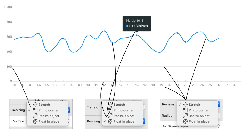
– how to correctly assign resize rules to specific elements.
Distribute layers and vector points
– stop wasting your time calculating spacing between elements and just let Sketch do the math.
When drawing a line chart manually, use the vertical and horizontal distribution function to distribute the data points, lines for the x-axis, and all the labels such that they have an even amount of space in between them.
Tables
Designing tables can often turn into a real nightmare, with the need to create and organize hundreds of text and vector layers for cell data, and row, column, and border styles. Whenever we need to add or remove a column, change the width of the table or of a specific column, or change cell data – it always affects all the other elements of the table and we spend way too much time fixing visuals after small changes… until now.
Since Sketch version 39, just like with graphs, we can now resize tables seamlessly by assigning resize rules to each cell and the containing elements. In addition, it makes sense to structure table rows in a specific way and heavily use shared styles to make updating and changing the content and visual styling easier and faster.
Organizing cells and rows
To make resize rules work correctly, all the containing elements, such as text, buttons, cell background and borders, need to be grouped together.
Cell backgrounds as well as the cell text layer should be set to “Resize object”, while elements (like sort indicator arrows) that need be pinned to the left or right border should be set to “Pin to corner”.
Reduce the amount of layers

– one layer with multiple inner shadows to create the cell borders.
The fewer layers we need to deal with the better. I usually try to limit them to two layers per table cell – one for the text and one for background and border effects. To create border lines between rows and columns, I use inner 1px shadows with Blur set to 0. This has two advantages: there’s no need to add additional layers to create borders, and you can use shared styles for all table cells, which allows you to change something like border color or cell background effects with one click for all the cells.
Generating Content
The most time-consuming task when designing a table is filling each row with individual data. With Craft, a Sketch integration by inVision, we can automate that task completely.
Fill cells with random data
To fill each cell with random data, create one row, select each text layer and assign one of the various data formats from the Craft Data panel. Then select the row group and open the Craft Duplicate panel and choose the amount of rows you want to create. Craft clones the row X times and inserts randomly generated but individual content.
– creating a table with random, but individual data in each cell within under a minute.
Fill cells with real data from your API
When working on designs for, e.g., a web or iOS application that already has a database and an API that serves content via JSON, you can import real data through the Craft data panel.
If the API is public, you can simply import JSON by inserting the URL for an API call. If the API requires a key or authentication, you will need to download a JSON file and import it manually, since the Sketch integration does not yet support authentication.

– selecting a field in the Craft JSON viewer.
After successfully importing the JSON data, select a text layer and then assign a JSON value from the data tree view. Repeat this for each cell and then proceed with duplicating the row as often as you need. When duplicating rows via the Duplicate panel, Craft will fill each table cell with real data from your API.