Back to all posts

Crafting good microcopy is a vital UX skill

(Photo by Nina Strehl)

Delight is in the details

When I think about the products I love, they all have one thing in common: delightful little details.

There’s this coffee shop I visit almost every day. Whenever I order a drink, they always add a little artwork on top. It might be a fancy leaf one day, a swirly swan the next. These foamy figures don’t make the drink taste any better, but they do make me smile.

This delightful detail shows that they put a lot of love into what they’re making. It’s just a little detail, a little shape, but it shapes how I feel about the product.

In design, one detail that often gets overlooked is microcopy — the little bits of text that guide us through an experience. In apps and websites, microcopy includes things like button labels, hint text, and error messages.

When used in the right places, microcopy can turn a mundane task into something memorable. In this story, we’ll see how microcopy can be used in all sorts of delightful ways.

By the end, I hope you’ll see just how magical microcopy can be.

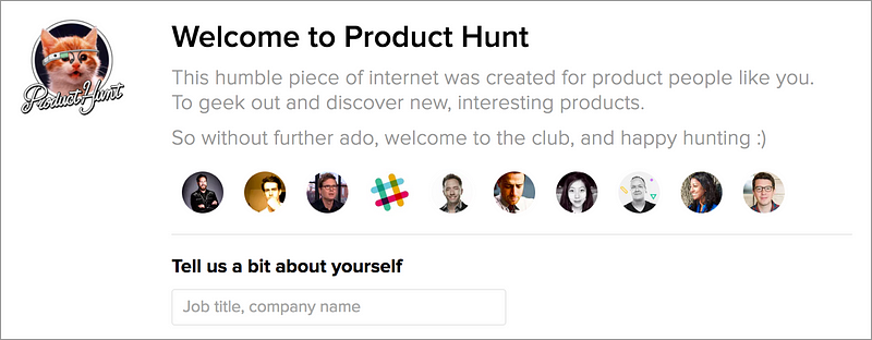
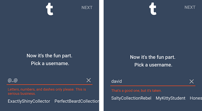
1. Show that you’re human

At my local grocery store, they have self-checkout lanes where I can scan my items and be on my way. Call me old-fashioned, but I prefer going to the real cashiers. Those lanes take longer, but I actually like chatting with real people.

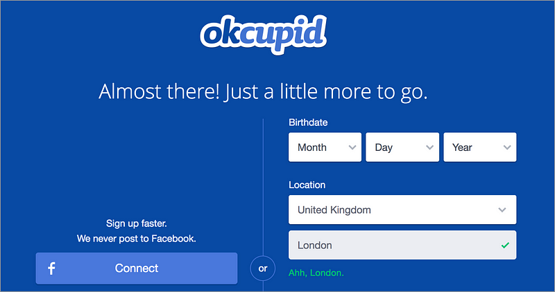
Words on a screen can never take the place of a real conversation, but good microcopy can show that real people created your product. If your product sounds human, it’s easier for people to trust you. Open up to your users, and they can open up to you.

Below are a few examples of products that sound human and conversational, like a friend who’s chatting with you.

Product Hunt’s tone is warm and welcoming. Notice the self-awareness (“humble piece of internet”), casual expressions (“geek out”), and smiley face.
Vimeo shows they have real humans in charge. Notice how they say “we”? Computers don’t say “we,” but people do.
Yelp uses a super casual tone. It encourages people to open up and leave an honest review.

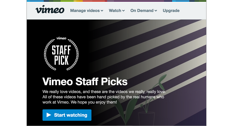
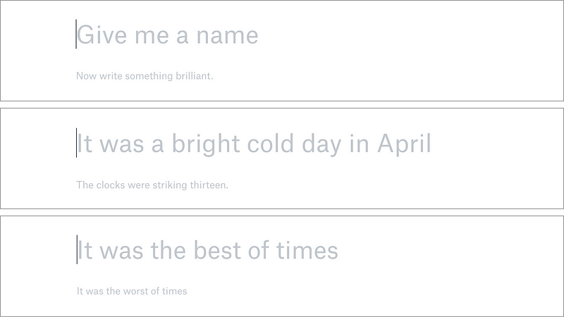
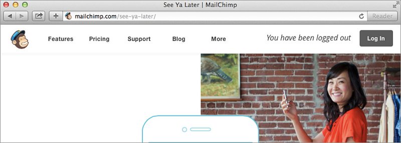
2. Sprinkle in some surprise

One way to create a feeling of delight is to use the element of surprise. Aristotle once said, “The secret to humor is surprise.” This idea also applies to microcopy:

“The secret to delightful microcopy is surprise.”
— Some dude on Medium

Sometimes, all you need is a well-placed message to put a smile on someone’s face. Think of safe places in your product where you can surprise people with a little delight:

  • A loading screen
  • A success message
  • An error message
  • An example or placeholder
  • An onboarding flow
  • An empty state

Let’s look at a few examples of microcopy being used in unexpected ways to create a feeling of delight.

Zeplin brews up some coffee as you wait for your page to load.️
Tumblr sneaks in some fun messages, while still being helpful.
After you create a few docs, Dropbox Paper shows different placeholder messages to get you in the writing mood.

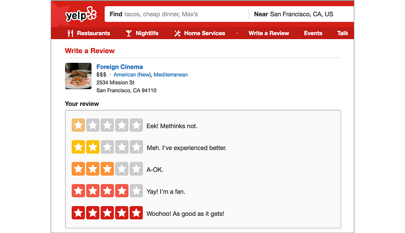
3. Boost their confidence

When we use most apps and websites, we often have a goal in mind. Maybe we’re trying to look up some info, order something online, or create something.

To get to that goal, there’s usually a series of steps we need to take. If those steps get tedious, some of us might give up and curse the internet gods. 😤

That’s when microcopy can help. In a multi-step flow, microcopy can encourage people to keep going. People are lazy. Sometimes, we all need a little motivation to get things done.

Below are a few examples of products giving people a friendly nudge to encourage them to do something.

Some people like to stay anonymous online, so Dribbble encourages you to enter your real name in a friendly way.
Some people might feel spooked by sharing their birth date, so Airbnb uses delight to reassure you.
Nordstrom compliments you after you add items to your cart. They’re reassuring you that you made the right choice.

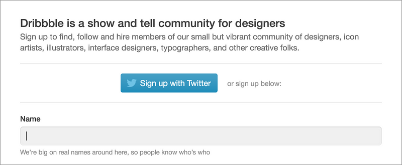
4. Get a little personal

The other day, I got a thank you card for attending a friend’s wedding. It started out like any other thank you card. “Thanks for joining us, yadda yadda yadda.” But then my friend slipped in a reference to something we did in high school. It brought back some good memories.

The thing that made the card special was that it was specific to me. Because of that specific memory from high school, I knew nobody else got the same exact message. It was personalized for me.

Sometimes you can replicate this good feeling through your microcopy. By customizing the message for a specific person or group of people, you can make them feel special.

Let’s see how some products create delight by customizing their messages for different people.

OkCupid compliments your city when creating a new account: “Ahh, London.”
Meetup lets organizers customize the name for participants, like “Bookworms.” That’s a lot better than “attendees.”
Asana greets you differently depending on the time of day. After 10pm, you’ll get “Hello, night owl!”

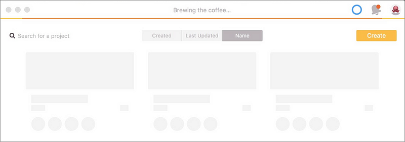
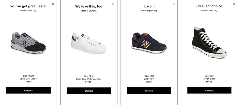
5. Sweat the details

If you look at any web or mobile product, you’d be surprised how much microcopy there is. Take Dropbox for example. Seems like a simple product without a lot of words. How many messages do you think there are in the Dropbox interface?

Believe it or not, Dropbox has over 27,000 messages in its interface. 27,000! By comparison, the first Harry Potter book has a little over 6,600 sentences. Do you know how many messages you have in your product? Probably a lot more than you’d expect.

So where the heck are all these messages? Well, they show up everywhere, from the top of your browser to the ALT tags in each image. Each message has an opportunity to delight, and a good writer will sweat the details for each and every message.

Take a look at how these products use delightful microcopy in the most obscure places.

When you log out, MailChimp says “See Ya Later” at the top of the browser.
Basecamp’s footer has a friendly message that changes depending on the day of week.
The Design/Content conference site has delightful ALT tags, like “Eileen Webb smiling at you and wearing a warm scarf.”

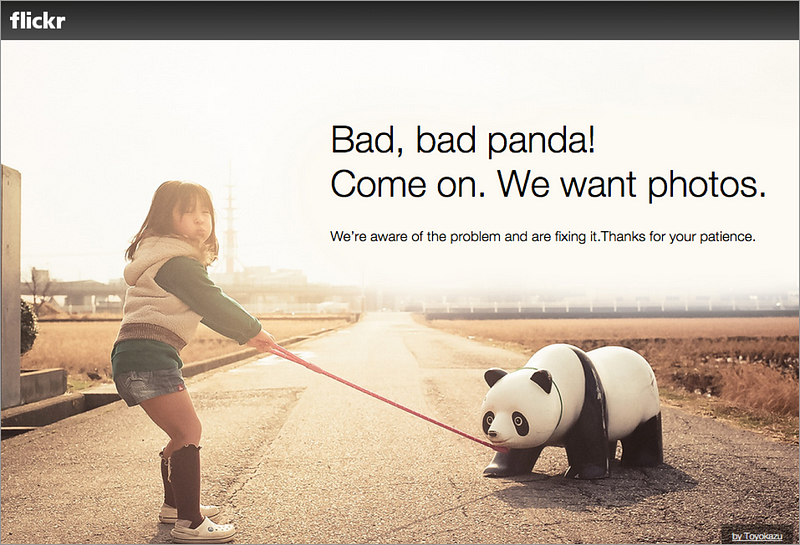
6. Pair it with a picture

Dr. Seuss is famous for delighting people by pairing words with pictures. His drawings are dreamy. His words are whimsical. But it’s when you pair them together that they truly become magical.

Here’s one of my favorite quotes from him:

“Words and pictures are yin and yang. Married, they produce a progeny more interesting than either parent.”
— Dr. Seuss (Theodor Seuss Geisel)

Whether it’s a photo, illustration, or emoji, a simple picture can sometimes be the perfect pairing for your microcopy. They work together to create a feeling of delight that’s more magical than words or pictures alone.

Let’s see some of this pairing in action.

Flickr pairs sad news with a lighthearted photo to keep your spirits up.
Hubspot’s error page pairs loving words with an image of a broken heart.
Slack pairs clever copy with a rocket ship emoji. The emoji makes the copy more memorable.

But hold up!

All this talk of delightful microcopy might sound fine and dandy, but honestly, it’s a hard thing to get right. You need to keep in mind the dangers of delightful design, because too much whimsy can get in the way.

In interface writing, it’s usually best to strive for brevity and clarity. But fun microcopy often requires longer messages and less clarity. Depending on your brand, you need to figure out where you stand on this spectrum. When do you optimize for clarity and when do you optimize for delight?

Before you start adding fun microcopy all over your product, here are a few things I’d recommend:

  • Find your voice. Put together guidelines for how your product should sound. Many companies have a writing style guide that defines their voice and tone. Need help getting started? Check out some examples on styleguides.io.
  • Don’t use clever copy in common flows. If someone has to read your clever copy every time they launch your app, it’ll get annoying really fast. Save the fun stuff for less common flows.
  • Take risks while you can. If you’re a smaller brand, it’s a lot easier to experiment with fun microcopy. Once you go global, microcopy has a tendency to get toned down. Don’t be afraid to experiment and see how people respond.
  • Consider randomized messages. Sometimes you can make an experience more delightful by showing a different message each time. This will make things a little more surprising, but it can still get repetitive over time.

Tiny words matter

After seeing these examples of delightful microcopy, I hope it’ll inspire you to look at your product in a new light. Microcopy plays a big part in shaping how people think about your product, so don’t miss out on the opportunity to delight people with words.

It’s not just about getting people from point A to point B. Sometimes, you gotta let ‘em enjoy the ride, too. 😎

This article was originally posted at:
https://uxdesign.cc/the-magic-of-microcopy-a56c5decbe1f

Can we take you from stuck to unstuck?

We'd love to hear from you

Product Design

The ‘Product’ is the website, service, application, interactive thing being worked on by the business. The practice of Product Design is similar in a lot of ways to UX Design. It involves the coming together of many specific design disciplines...

Call to action (CTA)

A call to action is a marketing term that refers to a prompt that invokes a response leading to a sale. When referring to a call to action (CTA) in the digital design world we usually mean the interactive element that leads to the next step in the experience - something that needs to be clicked or tapped.

User testing

User testing refers to a technique used in the design process to evaluate a product, feature or prototype with real users. There are several reasons why you might want to undergo usability testing, the most common is that it allows the design team to identify friction in a user experience they are designing, so that it can be addressed before being built or deployed.

WYSIWYG

WYSIWYG (pronounced WIZ-ee-wig) is an acronym for "What You See Is What You Get". It helps identify an an interface that allows user input resulting in an output that is rendered in a similar way. For example; a word processor application interface might resemble a piece of paper,so when printed the user can see how the output will appear.

Content Management System

A content management system (CMS) is an tool that allows a website editor/administrator to manage the content that is displayed. Websites are made of HTML and CSS to create pages. Pages can be hard-coded but would require technical development skills to make changes. A CMS usually allows a person without coding knowledge to amend existing and add new content to a website using a WYSIWYG interface.

Responsive Web Design

Responsive web design refers to a web page that dynamically adapts its layout to fit the size and orientation of the device on which it is viewed. A responsive design allows for a more optimised user experience across desktop and laptop computers as well as smartphones and tablets of varying sizes.

User Stories

User stories allow the functionality of a product or service to be expressed as written descriptions of an experience as seen from the users perspective. The writing of user stories creates a list of design and development tasks to complete in order to create any required functionality.

User Interface

A user interface (UI) is a conduit between human and computer interaction - the space where a user will interact with a computer or machine to complete tasks. The purpose of a UI is to enable a user to effectively control a computer or machine they are interacting with, and for feedback to be received in order to communicate effective completion of tasks.

Personas

A persona in UX Design is the characterisation of a user who represents a segment of your target audience. On a project you might create any number of personas to be representative of a range of user needs and desires. The solutions you design must answer these needs in order to deliver value to your target audience.

Card sorting

A great, reliable, inexpensive method for discovering patterns in how users would expect to find content or functionality. Card sorting is used to test the taxonomy of data with a group of subjects, usually to help inform the creation of the information architecture, user flow, or menu structure on a project.

Brainstorming

A technique used to generate ideas around a specific topic. Often done in groups, but can be done individuals. The process usually involves writing down all ideas around a topic onto paper, a whiteboard or stickies often implying some kind of association.

Minimum Viable Product

An MVP is a product that has the minimum set of features to prove the most essential hypothesis for a product. Businesses building a new product can create a Minimum Viable Product to prove that an idea is viable and warrants further investment. A further benefit being that the next stage of development can be informed by feedback obtained from testing that MVP.

Sitemap

A sitemap is a diagrammatic representation of a hierarchical system. It usually depicts the parent-sibling relationship between pages in a website, showing how sub pages might be arranged underneath their parent groupings. This arrangement forms a map of the site.

User journey

A user journey represents a sequence of events or experiences a user might encounter while using a product or service. A user journey can be mapped or designed to show the steps and choices presented as interactions, and the resulting actions.

Prototype

A prototype is draft representation built to test ideas for layout, behaviour and flow in a system. Prototypes are an indispensable tool for resolving a large number of potential issues in a concept or business before too many resources are deployed to put a design into production.

Wireframes

A Wireframe is a visual schematic that conveys a basic level of communication, structure and behaviour during the design of a system. Wireframes are low-fidelity designs that bypass including a detailed user interface or visual design, conveying just enough to get across the core idea.

Usability

To say something is usable is a qualitative statement about how easy that thing is to use. Usability is an assessment of how learnable a system is and how easy a user finds it to use. The usability of a system or product is a key factor in determining whether the user experience is a good one.

Information Architecture

Information architecture is the design and organisation of content, pages and data into a structure that aids users understanding of a system. A more organised system enables users to more easily find the information they require and complete the intended tasks.

UI Design

User Interface Design is the discipline of designing software interfaces for devices, ideally with a focus on maximising efficiency, responsiveness and aesthetics to foster a good user experience.

UX Design

The practice of User Experience (UX) Design is the coming together of many specific design related disciplines to improve the usability, responsiveness, uptake and aesthetics of a product or service.

User Experience

A general term that covers all aspects of a user's participation while engaging with something that has been designed. Usually when talking about User Experience in the digital design field it refers to the interactions, reactions, emotions and perceptions while using an app, service, website or product.