New Twitter iOS app & web UI review

Following the recent Twitter web UI redesign across all its platforms (new twitter GUI PSD resource we created available to download for free) I thought it a good time to look back and reflect on the still annoying interface niggles & inconsistencies that inhibit an ideal user experience across the board by providing a twitter iOS app and web UI review. As brilliant as twitter is, I hope to highlight how it could be made better and would hope to see some of these features being released over the course of the next few years.

I (as I imagine most users do) use a collection of interfaces to access twitter throughout the day and week. At work I use the web UI, on the go I use mobile app, and at home I use the iPad app. Sometimes TweetDeck (for Chrome). Sometimes Buffer.


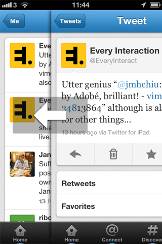
Native UI vs 3rd party

I always used to use 3rd party apps (mostly Tweetdeck) to access twitter but found myself of late gravitating more towards the web interface as it has gradually improved. For such a long time it was the service rather than the interface that was the appeal, allowing the 3rd party clients market to thrive. I believe the tables are starting to turn now twitter is both stable and improving its experience all the time. I also found as my twitter activity grew I found the multi column approach with dynamically updating feed that Tweetdeck offers too much to take in. I started preferring a timed stints approach of allowing myself access for short periods of time during the day. I liked the idea of picking up where I left off and slowly realised it’s not the end of the world if some tweets slipped by unread.

Although I may reflect upon features of some 3rd party apps as nice additions, I’ll focus mainly on the native twitter UI’s for this analysis. Follows a critique identifying everything that annoys me day-to-day using twitter across it’s variety of interfaces.

How twitter could be further improved

Account switching

The mobile apps have account switching, within a few taps via your account page you can switch to any number of multiple accounts you run. This could be further improved by allowing easy account switching directly from the main timeline by tapping on the Twitter icon in the reader bar.

Account switching on twitter mobile interface mockup

The existing quick profile switching while composing a tweet (accessed by tapping the account name in the header to access a list) is especially useful. Admittedly it’s harder to log out of and back into a mobile app than a webpage, but why don’t we have this feature included in the web UI? Other 3rd party apps manage multiple accounts better, but thats what many are specifically designed to do. Makes perfect sense for the twitter web UI to add fast account switching (much like the updated google account bar), or perhaps some way of blending multiple feeds into a single experience.

twitter account switching in web UI mockup

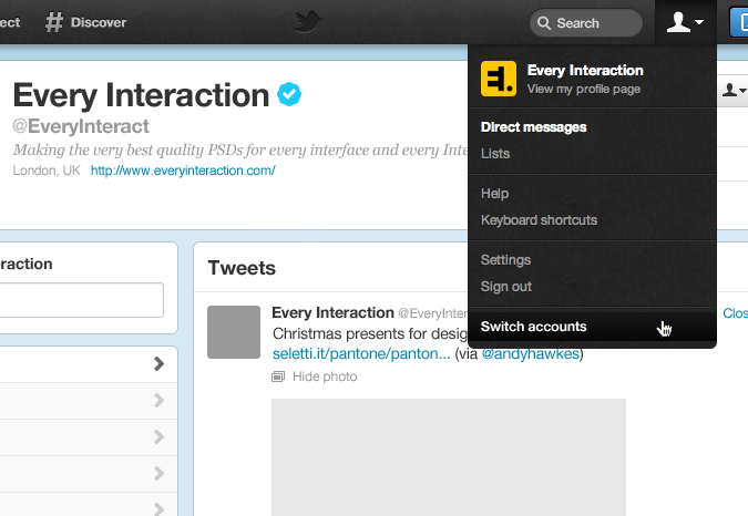
The simplest solution I can think of would be to add a ‘Switch account’ link in the existing account menu, launching a small overlay or side-menu allowing account selection.
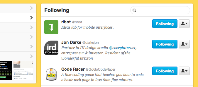
Who follows who?

There is currently an inconsistent solution to identifying if a user follows you or not. The mobile interfaces do nothing to indicate this, however the web UI does. It a useful feature that should be carried over to all interfaces.

Twitter account user follows you


Search

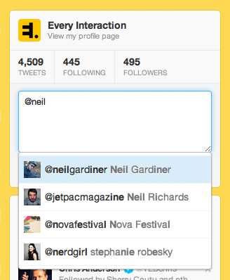
Twitter search is not great and has always been something other tools are superior at performing. With the recent UI updates it has improved significantly. But what I can’t do is search my own data. I want to be able to keyword search my own tweets, as well as search those I follow and those who follow me. As so many people use handles that are not their name, when trying to mention someone it’s often difficult to remember what they’re called. A simple search field in the followers list would remedy this issue, ideally with results generated/filtered below as you typed.

Search your followers in Twitter web interface

Also the whizzy @ list that allows quick user selection as you compose does not behave with much consistency. Sometimes it is able to find user I do follow (and remember their handles), other times it completely fails to do so?

Twitter compose follower search

While we’re on the subject of finding those who I follow/follow me, in the web UI this is presented as scroll-loading page. 20 users per load. Because of this I have at times exhausted my access allowance on twitter trying to load everyone by scrolling down, loading this page over 20 times in order to generate the complete list. This is just crazy. Load everyone at once or present normal pagination with a ‘show all’ link.

Other UI additions

Other things I could see being useful additions to the mobile app might be better thumb control for the phone app. One-handed browsing is common, so a ‘back/side swipe’ rather than top left button to return to previous screen would be a useful addition.

Twitter mobile app side swipe navigation


Mac desktop app

The twitter desktop app is far too basic, does little well, and is frustrating to use. I won’t dwell as this topic could turn into a post unto itself, and it’d take a lot of work devise a suitable replacement concept. Another time…


What twitter does well now

Can’t end this post without pointing out how great twitter really is and how far it has come in the past year. So below are a couple of really amazing interface additions for carrying UI’s that are very welcome additions.

Search

As I mentioned before search has improved a lot. Separating the people and tweets search although might seems confusing at first makes a lot of sense as the results they produce are very different. The way the default search changes for both the ‘Connect’ and ‘Discover’ areas works as once you’re in the results area you can quickly switch form one set of results to the other. This does away for the need to have a separate ‘Search’ section as previously found on the mobile interfaces.

Twitter mobile search results - people


Tweet stream

Greatly improved for the mobile app. The mobile app design has always loaded only the recent tweets, leaving a /torn effect/ gap representing the time gap between the last load and the new tweets. Tweets that fell into that gap were forever missed, but now there’s the option to load more tweets in timed stints to fill those gaps, meaning should you desire you never need miss a single tweet.

Twitter mobile app - load more tweets


Overall twitter UI design

Since the update the overall design of both the mobile app and the web UI have improved (although we’re still waiting for a similar update to follow for the iPad app design). It does take a little getting used to and I still struggle to find the post field on the rare occasions I submit a post through the web UI. But overall I think the team at twitter have done amazingly well, and we hope to see them continue to develop the UI and features set (to possibly include some suggestions above?) and grow the service into an ever more useful and wonderful social network.


Download the Twitter GUI PSD for free

What are your favourite UI features and gripes with Twitter? Keen to hear everyones thoughts and ideas for future improvements.


Creative Review January 11th 2012

You might also be interested in...

Product Design

The ‘Product’ is the website, service, application, interactive thing being worked on by the business. The practice of Product Design is similar in a lot of ways to UX Design. It involves the coming together of many specific design disciplines...

Call to action (CTA)

A call to action is a marketing term that refers to a prompt that invokes a response leading to a sale. When referring to a call to action (CTA) in the digital design world we usually mean the interactive element that leads to the next step in the experience - something that needs to be clicked or tapped.

User testing

User testing refers to a technique used in the design process to evaluate a product, feature or prototype with real users. There are several reasons why you might want to undergo usability testing, the most common is that it allows the design team to identify friction in a user experience they are designing, so that it can be addressed before being built or deployed.

WYSIWYG

WYSIWYG (pronounced WIZ-ee-wig) is an acronym for "What You See Is What You Get". It helps identify an an interface that allows user input resulting in an output that is rendered in a similar way. For example; a word processor application interface might resemble a piece of paper,so when printed the user can see how the output will appear.

Content Management System

A content management system (CMS) is an tool that allows a website editor/administrator to manage the content that is displayed. Websites are made of HTML and CSS to create pages. Pages can be hard-coded but would require technical development skills to make changes. A CMS usually allows a person without coding knowledge to amend existing and add new content to a website using a WYSIWYG interface.

Responsive Web Design

Responsive web design refers to a web page that dynamically adapts its layout to fit the size and orientation of the device on which it is viewed. A responsive design allows for a more optimised user experience across desktop and laptop computers as well as smartphones and tablets of varying sizes.

User Stories

User stories allow the functionality of a product or service to be expressed as written descriptions of an experience as seen from the users perspective. The writing of user stories creates a list of design and development tasks to complete in order to create any required functionality.

User Interface

A user interface (UI) is a conduit between human and computer interaction - the space where a user will interact with a computer or machine to complete tasks. The purpose of a UI is to enable a user to effectively control a computer or machine they are interacting with, and for feedback to be received in order to communicate effective completion of tasks.

Personas

A persona in UX Design is the characterisation of a user who represents a segment of your target audience. On a project you might create any number of personas to be representative of a range of user needs and desires. The solutions you design must answer these needs in order to deliver value to your target audience.

Card sorting

A great, reliable, inexpensive method for discovering patterns in how users would expect to find content or functionality. Card sorting is used to test the taxonomy of data with a group of subjects, usually to help inform the creation of the information architecture, user flow, or menu structure on a project.

Brainstorming

A technique used to generate ideas around a specific topic. Often done in groups, but can be done individuals. The process usually involves writing down all ideas around a topic onto paper, a whiteboard or stickies often implying some kind of association.

Minimum Viable Product

An MVP is a product that has the minimum set of features to prove the most essential hypothesis for a product. Businesses building a new product can create a Minimum Viable Product to prove that an idea is viable and warrants further investment. A further benefit being that the next stage of development can be informed by feedback obtained from testing that MVP.

Sitemap

A sitemap is a diagrammatic representation of a hierarchical system. It usually depicts the parent-sibling relationship between pages in a website, showing how sub pages might be arranged underneath their parent groupings. This arrangement forms a map of the site.

User journey

A user journey represents a sequence of events or experiences a user might encounter while using a product or service. A user journey can be mapped or designed to show the steps and choices presented as interactions, and the resulting actions.

Prototype

A prototype is draft representation built to test ideas for layout, behaviour and flow in a system. Prototypes are an indispensable tool for resolving a large number of potential issues in a concept or business before too many resources are deployed to put a design into production.

Wireframes

A Wireframe is a visual schematic that conveys a basic level of communication, structure and behaviour during the design of a system. Wireframes are low-fidelity designs that bypass including a detailed user interface or visual design, conveying just enough to get across the core idea.

Usability

To say something is usable is a qualitative statement about how easy that thing is to use. Usability is an assessment of how learnable a system is and how easy a user finds it to use. The usability of a system or product is a key factor in determining whether the user experience is a good one.

Information Architecture

Information architecture is the design and organisation of content, pages and data into a structure that aids users understanding of a system. A more organised system enables users to more easily find the information they require and complete the intended tasks.

UI Design

User Interface Design is the discipline of designing software interfaces for devices, ideally with a focus on maximising efficiency, responsiveness and aesthetics to foster a good user experience.

UX Design

The practice of User Experience (UX) Design is the coming together of many specific design related disciplines to improve the usability, responsiveness, uptake and aesthetics of a product or service.

User Experience

A general term that covers all aspects of a user's participation while engaging with something that has been designed. Usually when talking about User Experience in the digital design field it refers to the interactions, reactions, emotions and perceptions while using an app, service, website or product.