A little thing like capitalisation can be a big deal

Can you spot the differences with the messages above? The left side has a few more capital letters than the right side. Big O, little o. Who cares, right?
Well, if you write for an app or website, you should care. A little thing like capitalisation can actually be a big deal. Capitalisation affects readability, comprehension, and usability. It even impacts how people view your brand.
We’ll get to the juicy stuff in a bit, but first, let’s start with a little more background about capitalisation.
Title case vs. sentence case
In most products and websites today, there are two ways to capitalise words:
- Title case: Capitalise every word. This Is Title Case.
- Sentence case: Capitalise the first word. This is sentence case.
If you’re an Apple user, you’ll notice a lot of title case throughout their products. That’s because Apple’s design guidelines recommend title case for many UI elements, including alert titles, menu items, and buttons.
If you’re a Google user, you’ll see a lot more sentence case throughout their products. And that’s because Google’s design guidelines recommend sentence case for almost everything.
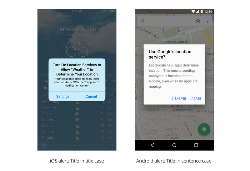
Whether you’re on Team Apple or Team Google, Team iPhone or Team Android, it’s good to know what you’re getting into when you use title case or sentence case. Let’s take a closer look at each style.
What’s good about title case?
First, let’s see why you might want to go with title case.
More symmetry
Some people think title case looks better because it’s more symmetrical. As long as your phrases are short, title case creates a nice visual rhythm to your words:

There’s beauty in symmetry, and sometimes that’s a good enough reason for a designer or writer to choose title case over sentence case.
More visual prominence
“Visual prominence” is just a fancy way of saying that title case stands out more. The capitalised letters act like raised hands 🙌, giving your title or heading more emphasis. Title case is especially useful if you can’t adjust font styles. It helps differentiate your title text from your body text.

Notice how the title on the left pops out more than the title on the right? The more it stands out, the more likely someone will actually read it.
More “gravitas”
Much like the word “gravitas,” title case gives your words a feeling of formality and importance. Sites like The New York Times and USA.gov primarily use title case. It’s Professional. Serious. Established.
Using title case is like dressing your words up in a suit. For certain brands, you might want your words to look like they mean business. If you’re in the business of security, for example, title case is more likely to feel professional and trustworthy compared to sentence case.

Imagine you’re a company exec. Which version feels more professional?
What’s good about sentence case?
Next, let’s see why you might want to go with sentence case throughout your product or website.
Easier to read
The biggest reason to use sentence case is that it’s easier to read, especially when the text gets long. Can You Imagine How Difficult It Would Be to Constantly Read Long Titles in Title Case?
That’s why it baffles me to see the screenshot below in Apple’s guidelines. (In case you were wondering, it’s the same screenshot I used earlier on.)

Easier to define
According to Google’s first UX writer, Sue Factor, one of the main reasons why Google decided to go with sentence case was because it was just easier to explain to designers and engineers. In a product interface, it’s not always clear what’s considered a “title.” Is a tab name a title? How about a settings checkbox? Or a confirmation message?
On top of that, there are multiple ways to do title case. Do you capitalise prepositions like “from” or “through”? How about articles like “the” or “an”? Depending on which style guide you follow, the exact rules for title case can be different. Below are the title case rules according to Apple:
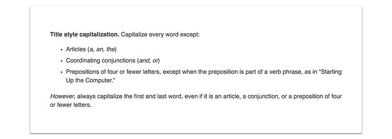
If you have multiple people writing for your product or website, it’s easy for people to forget all the rules when writing in title case. You can avoid this confusion by just using sentence case everywhere. There’s only one way to do sentence case, so it’s harder to goof up.
Friendlier
Just as title case looks more formal and serious, sentence case looks more casual and friendly. I’m a writer at Dropbox, and we intentionally write in sentence case because we want our brand to feel natural and approachable. We think our product’s voice sets us apart from our competitors, and using sentence case is one way for us to maintain that voice.

Easier to spot proper nouns
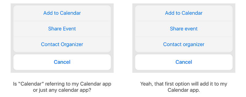
Finally, sentence case also makes it easier to read phrases with proper nouns. Proper nouns are words that you’d always capitalise, like your name, New York City, or Microsoft.
A lot of companies nowadays give their features and products descriptive names like “Inbox” or “Calendar,” as opposed to whimsical names like “Spark” or “Fantastical.” If you use title case in all your buttons, it becomes unclear whether certain things are proper nouns or not—and that can affect usability.
Any other cases?
Title case and sentence case are the two most popular styles of capitalisation, but they certainly aren’t the only options out there.
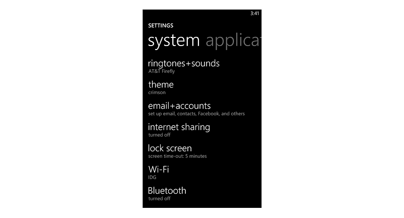
Case in point: On Windows Phone 8, Microsoft used a lot of lowercase text throughout their interface, even for titles and buttons.
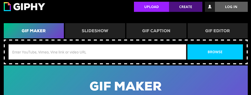
Then there’s GIPHY, one of my favorite sites ever. Their site uses uppercase all over the place, which makes sense for them because meme text is usually written in all caps.
Making a case for yourself
Title case and sentence case both have their advantages. Whichever direction you decide to go, just make sure you make an informed decision that makes sense for your brand. The worst thing you can do is to not have any standards at all, which eventually leads to inconsistencies that’ll be a pain to fix later.
Once your users start noticing inconsistencies, that’s when they start losing trust in your brand.