Apps and websites that are intuitive and engaging have always outshined those that are clunky and confusing. These days, however, consumers expect better experiences from their digital products than ever before.
Therefore, it’s the ideal time to prioritize user experience (UX) design because brands that leverage exceptional UX will beat those that try to compete on the basis of price or functionality alone.
If you’re a business that personally maintains its digital presence, you simply can’t afford to neglect your website or app’s UX. And if you’re a freelancer or an agency, it’s essential to convince your clients to understand and buy into the importance of UX as a fundamental tenet of the design process.
It’s often said that good design becomes invisible. If so, how do we wrap our heads around designing a good user experience when the nature of UX itself seems ephemeral, to begin with?
Thankfully, UX researchers and designers have been tackling this question for a while now — since at least the 1980s, when it was called Human-Computer Interaction. So, while the task can be tricky, we have some resources at our disposal.
In this article, I will share three specific frameworks to guide UX design discussions for websites and mobile apps and recommend when you should use each.
By the time you finish reading, I hope you feel empowered with the tools needed to champion the user as the central element of your clients’ or your digital assets.
What UX Isn’t
Before we get to the frameworks, let’s start by achieving some clarity on what UX is all about, in case you’re new to the term or find the concept a bit murky.
Since UX often gets lumped in with many other fields, and there are many misconceptions about it, we’ll first talk about what UX isn’t before we discuss what it actually is.
UX is not UI
The user interface (UI) describes the aesthetic design of the elements of a product with which a user interacts. In the context of digital products, this is the “skin” of the interface, and the part most affected by graphic design trends.
For example, apps on early iPhones used skeuomorphic design, where elements resemble their real world counterparts.
Apple then moved to a flat design around 2012, where elements were pared down to simple 2D shapes.
Now, we’re beginning to enter an era that could be called “Flat 2.0,” where we’re adding shadows, subtle gradients, and more sophisticated animations to the original flat style.
Beyond contributing to the visual appeal of digital products, the differences among these styles don’t necessarily have a large impact on the user experience.
You easily can imagine a beautiful, sleek-looking interface that’s confusing to navigate, buggy, and lacking any guidance about what elements are or what they do. Conversely, you can just as easily conceive of a dull, visually boring UI that’s intuitive, easy to navigate, and always works as expected.
That’s the difference between UI and UX.
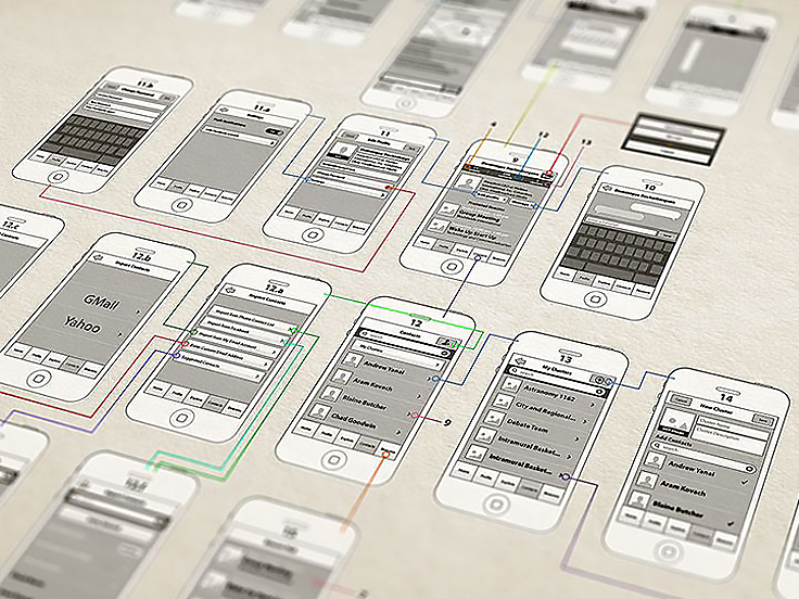
UX Is Not Just About Wireframes
Wireframes – the gray scale representations of the general layout of a website or an app – are a common deliverable of the UX design process and are an essential tool in bridging the gap between the core responsibilities of UX and UI designers. However, the wireframes are not the entirety of UX design, even though people often conflate the two.
One reason why wireframes and UX design get mixed together is that many professionals claim to do both UX and UI design. This isn’t automatically a problem, since it’s completely feasible for one individual to handle both duties.
Unfortunately, many graphic designers simply add a few wireframes to their portfolios and claim to be UX designers when they don’t actually have experience in this field.
Granted, you don’t need to be a professional UX designer to work on the UX of your website or mobile app, but you need to know that there’s more to it than that.
Another reason for the focus on wireframes is that they are tangible; we understand what they’re for. It’s easy to look at one and say, “Oh, the image goes here, the logo goes there, here’s block of text, and ... okay, the navigation pulls out from the side. Cool!”
However, there’s a lot of research and psychology hidden below the surface of a good wireframe design. These factors are what UX design is all about.
What UX Is: Understanding Your Users
UX design is about understanding the psychology, habits, moods, and goals of your users and building a digital product that genuinely helps them do what they are trying to do.
Generally speaking, a good UX allows a user to easily and intuitively carry out their intended goals while a poor UX impedes a user from accomplishing their goals.
To drive home the importance of designing products, mobile apps, and websites with the user in mind, a recent survey found that 52% of people said that a bad mobile experience made them less likely to engage with a company in the future.
Organizations that overlook their mobile UX may be unwittingly saying to their audience that they are not as consumer-focused as they claim to be.
More fundamentally, they are sending the message that they don’t understand their users.
Introducing Three UX Frameworks
Now that we understand what UX is and what UX isn’t, let’s take a look at three frameworks that help organize our thinking around understanding users and designing extraordinary experiences for them.
Framework #1: The Hierarchy of User Experience Needs
This may not be the most popular of the three frameworks in this article, but the Hierarchy of User Experience Needs is the probably the easiest to understand and thus a good place to begin.
Similar to Maslow’s Hierarchy of Needs, the hierarchy of user experience needs uses a pyramid shape to indicate the relative importance of various parts of your digital product user experience.
While many leaders in UX design have translated Maslow’s hierarchy to the field, I’m particularly fond of Lyndon Cerejo’s version, first created in 2001. It’s simple, useful, and a great tool to build a solid understanding of the different layers that make up a good user experience.
You can use it to guide a discussion for improving the UX of an existing website or app or as a way to talk about various decisions your clients need to make for their digital assets.
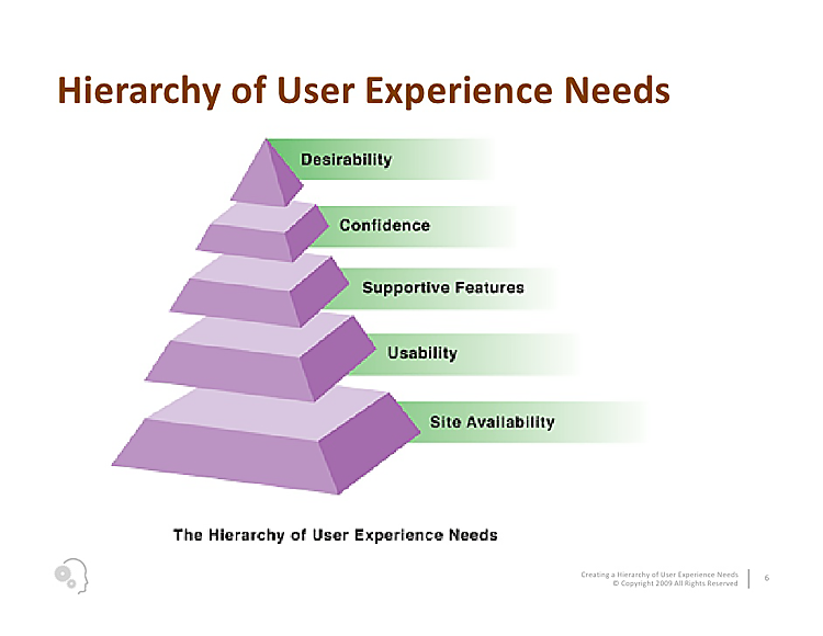
The hierarchy of user experience needs have five parts:
1. Site Availability Layer: You would think that this goes without saying, but when a user isn’t able to access your website or your app can’t reach the APIs it needs, then there’s no experience to be had at all! This is analogous to basic physiological needs, like food and water, in Maslow’s hierarchy.
2. Usability Layer: Some of the questions addressed at this layer include:
- Are you able to navigate to each section of your website easily?
- Are the buttons in your app easy to tap?
- Is all the text legible? Does everything function consistently?
3. Supportive Features Layer: Deals with how you are supporting users who use your product and encouraging the kinds of interactions that you want.
Example questions in this area include:
- Does your app guide a new user through its primary functionality?
- Does your online store offer reviews and suggested products?
- Does your website have a FAQ section or live chat?
4. Confidence Layer: This area is especially important if you are accepting payments through your website or app.
The fundamental issue here is whether your users feel confident enough to invest their time, personal information, or other resources in what you are offering.
For example, if you offer an eBook in exchange for entering an email address, can your users trust that you won’t spam them or sell their addresses to third parties?
If you offer a subscription service through your app, is it easy to unsubscribe later if a user no longer wishes to receive communications?
5. Desirability Layer: This is at the top because before you can focus on creating an attractive user interface with the bells and whistles that you or your users want, your website or app must first be always available, usable, supportive, and trustworthy.
There are many options here, but you want to make sure that anything you do on this layer doesn’t negatively impact the ones below it.
For example, a new feature may be desirable to users but not if it requires large images or JavaScript libraries that greatly increase load time.
Similarly, from a UX design perspective, a drop-down menu that is beautifully animated but difficult to use is no better than an intuitive one without the frills.
Framework #2: The UX Honeycomb
The UX Honeycomb is a tool that breaks down the factors that contribute to a positive user experience into seven main factors.
- Useful
- Desirable
- Accessible
- Credible
- Findable
- Useable
- Valuable
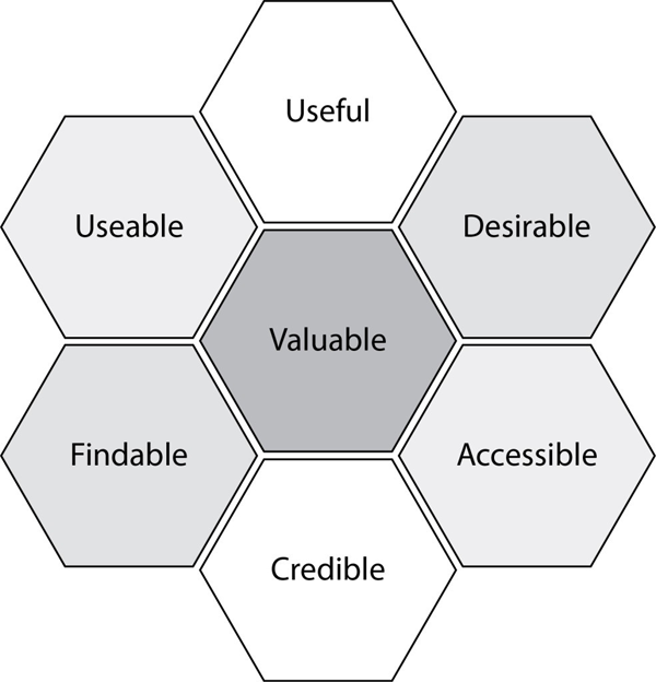
The UX Honeycomb is a bit more technical than the pyramidal hierarchy of user needs above, and as such, may be better suited for the start of a new project or a redesign, rather than for upgrading or maintaining an existing website or mobile app.
Usable, desirable, credible, and findable are similar to points already covered in the pyramid discussion above (though findable may relate more to navigability than to availability here).
Let’s focus on the three new topics in this graphic.
Useful Hexagon: Prompts us to consider users’ motivations. Why would a user want to interact with your website or app to begin with? And, given that goal, does the site truly allow them to achieve it?
For example, most “brochure” type websites are intended to give potential customers information about a business and the products or services it offers. If that’s the goal of the site, but the information is not present or is difficult to find or understand, it’s not useful.
Accessible Hexagon: Refers to designing for accessibility, meaning that the design elements should accommodate individuals that may have disabilities.
For example, someone who is colorblind may not be able to see which field in a web form is generating an error if the only indicator is a red border around the entry. Accessibility is very complex field and is worth investigating to allow greater audience access to what you’re building.
Valuable Hexagon: When all six of the outer factors in the UX Honeycomb are properly addressed, you create something that is truly valuable for your target audience. This ensures that they will keep coming back.
Framework #3: The Elements of User Experience
The last model we’ll look at is the most comprehensive – more of a unified theory of user experience than a tool. It is best used to gain a conceptual understanding of how meaning is translated through the design of a digital product.
Jesse James Garrett developed the Elements of User Experience in 2000 to describe a holistic view of UX and to illustrate the context for decisions that user experience practitioners make.
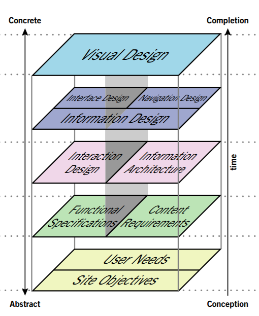
The distinguishing feature of the model is that the activities of the layers occur at the same time – are concurrent – but are described at different levels of abstraction.
For example, the visual design not only incorporates the characteristics of the aesthetic (Flat vs Flat 2.0) but also the goals of the user (contrasting colors to guide the UX).
Everyone understands the visual aspect of an interface because it’s the most concrete. But other layers, such as information architecture and functional specifications, are always happening, just under the surface.
Let’s look at each layer briefly.
Layer 1: Site Objectives & User Needs
At the bottom we have the dual layer of Site Objectives and User Needs, which sometimes are in alignment, and sometimes are not.
Consider how many times you’ve been interrupted while reading a website to sign up for an email newsletter, a subscription service, or some other kind of “exclusive offering.”
Clearly, in these cases, the site’s designer decided that the company’s objectives were more important than the user’s needs. This is a balancing act, especially if you’re trying to make money directly from the website or app – you need to ask for the sale, but without alienating your users.
Layer 2: Content Requirements & Functional Specifications
The next level contains Content Requirements and Functional Specifications. Content, believe it or not, is also a component of UX — the types and amount of content on your site or app will determine how to organize the layout for the best user experience.
Many people advocate for content-first design, opting out of the standard Lorem Ipsum (and its many variants) in favor of real content intended for use.
Functional Specifications refers to how the content will be delivered.
We now have many devices with various screen sizes and limitations: TVs, desktops, tablets, phablets, phones, smartwatches, and now virtual reality headsets as well. Which of these will you prioritize? How will you manage layout when rendering for multiple outputs that may be very different?
Layer 3: Information Architecture & Interaction Design
The middle layer contains Information Architecture and Interaction Design, two disciplines with too much complexity to cover here. In a nutshell, they ask the question: How is all the information organized, and how can you interact with it all?
Layer 4: Interface, Navigation & Information Design
Next up, Interface Design, Navigation Design, and Information Design. The first two are pretty self-explanatory.
Information design is the practice of presenting information in a way that fosters its efficient and effective understanding.
Interface, navigation, and information are combined to create the wireframes that most people understand as the deliverables of the UX process.
Layer 5: Visual Design
Finally, on top, is the part that everyone loves: the Visual Design layer. This is where we wrap up all of the design and work from the lower layers with appealing graphical design.
Conclusion: How to Use the Frameworks
The three frameworks presented in this article represent different ways of understanding the problems present in user experience design and offer pre-established approaches for how to begin solving them.
Each model touches on different aspects of UX, and each has its own approach that can add significant value to the UX design process.
For example, you may wish to use one model, like the Elements of User Experience Design, internally for discussing projects with your team and another, like the Hierarchy of User Experience Needs, to aid with decisions related to client projects.
Whatever approach you choose, there’s something in each framework to guide productive conversations about how users experience digital products.
Every conversation we have about UX makes the Internet a better place.