Apparently, UX people love to argue.
There are always topics that end up in endless debates. Just try one of the following questions as a conversation starter when meeting a designer:
- “Is material design good or bad?”
- “What is the best prototyping tool?"
- “Should I really never put a carousel on a website?”
What you’ll find is that responses might vary but most designers have very strong opinions which they’re eager to share.
What you will rarely hear, though, is:
“I don’t know, it depends.”
Maybe that’s because UX designers are usually considered the wise ones with the ultimate answers. But I’m afraid there aren’t many ultimate answers in UX. It’s an ever-changing area where we constantly try to find the right balance between our users, technology, business, and other stakeholders.
UX design is not about knowing the right answers. It’s about finding them.
Material design may or may not be a good choice for your project. But without any specific details, the question does not make much sense. What do you want to design? What problem is your design supposed to solve? What’s the interface like? Who’s the audience? What device do they use? And by the way, what exactly do you mean by material design? It depends on so many things.
Finding the best prototyping tool is a hard challenge — there’s plenty of them. They’re usually very different and nearly impossible to objectively compare. But it’s safe to say that the best one for you is probably the one that is easy for you to learn, that is compatible with the tools you are currently using, that has the functionality you need to try your ideas, and so on. It all depends on your needs and skills.
Design decisions are not all black-or-white
Even generic design principles can be challenged at times. There’s no one-size-fits-all solution. When making design decisions, you have to consider a lot of things. It always depends.
Bad patterns can sometimes be right
The hamburger menu was declared an inefficient navigation pattern at least a million times. It hides the available options, which is bad, right?Actually, it depends. What if hiding those options is actually your design intention? What if all the relevant call to actions are prominent and visible on the screen and the hamburger menu only contains secondary options? Isn’t then the hamburger navigation a great pattern to de-emphasise secondary items?
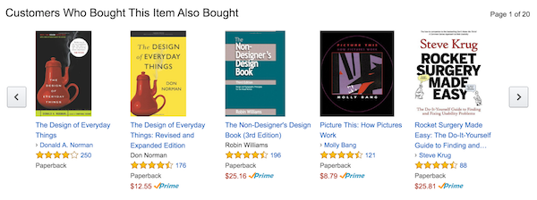
Carousels have a bad reputation, too. It’s an off-canvas technique where some of the content is hidden so some users might not be able to find it. But again, what if those parts are intentionally hidden, because they’re secondary? Couldn’t the carousel be a great pattern to differentiate between the obvious, the easy, and the possible options? Just like how Amazon displays related products in a paginated carousel or how Airbnb lets you browse through photos of an accommodation without leaving the search results page.


Are carousels always bad?
Even usability principles can be relative
The word intuitive is probably the most overused adjective in UX design. People won’t take the effort to learn how your interface works so it should be as intuitive as possible, right? Actually, it depends. Apple once changed the scrolling direction which was probably the most counter-intuitive design call ever. And still, many people got used to it quickly. Websites like Facebook or Amazon change their interfaces every day and people do take the effort to learn these changes because they want to use these products. So while being intuitive is important, if your audience is motivated enough to learn, it may not be the most important issue. It depends.
Most designers agree that you shouldn’t give users too many options. Actually, it depends. What if the range of options is a primary value of the product you’re designing? Photoshop, Axure, or Excel are great examples. They all have super complicated functionality and cluttered screens and yet people use it every day! (Although users can customise the toolbars to some degree.) So it’s not always a terrible idea to have tons of choices on the interface. It depends.
In most cases, context is everything
What works well for another product might not work for you. What works well on a screen might not work on another one. That is because context is key in UX: you should give the users what they need, exactly when they need it. It’s even more important than being consistent or following guidelines.
It’s really okay not to know
If UX designers knew everything, user research would not exist. So the next time you’re asked a question that cannot — or shouldn’t — be answered, just say: “I don’t know”. And then make sure to try to find the answer. Maybe it’s just asking some further questions. Maybe it’s talking to users. Maybe it’s doing some A/B testing.
“The true method of knowledge is experiment.”
–William Blake
Looking for such answers is actually the most exciting part of our job. Asking and answering philosophical questions is not. Or maybe it is. I don’t know. It depends.