My impressions following an Apple Watch try-on appointment. Style is more important than you think.
As a User Experience Design Agency we are expected to be able to design for any interactive medium. Right now we’re working on an app that will have an interface for iPhones, iPad, CarPlay and the Apple Watch. We made our pre-orders for the watch on release day, but had yet to have the experience of using one ourselves other than what we have read and viewed online. And so I booked myself into a trial appointment for the Apple Watch at our local Apple Store.
For cost saving purposes and having read all the reviews in advance, I was cautious and ordered myself a 42 mm aluminium Apple Watch Sport model with fluoroelastomer band. Two actually; a black and a white one, although I expect to return my least favourite one once I have tried them both. Being a purchase mostly for work (I keep telling myself) I needed to make a sensible financial decision and could hardly justify spending £500-£1000 on a device that is both a first generation product and partly for testing purposes, but this will still be a personal device I use everyday. I have to have one in order to fully understand its utility and how to design for it effectively.
I am already regretting my purchase decision and might change my mind…
The try-on experience was interesting in that you had to pre-book appointments. There is a special line in which to queue, after checking in you are escorted to your Apple Store representative waiting to give you a demo on the shopfloor. The watches are kept inside a electronically locked drawer opened with hose iPods stuck inside a chip and pin card reader devices that you see used in the Apple Stores (come on Apple, looks like these are still using iOS5). Each watch is removed individually and polished before handing over for fitting.
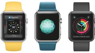
You’re given 30 minutes. The demo units you can wear are running a rolling demo; it’s a looping example that covers the majority of the main functions in a way that does not allow you to interact with them. Whilst wearing the watch you can interact with a second watch that is connected to a display stand paired with an iPad mini. This is a fully interactive version of the watch and the native apps that come pre-installed. The Apple Store rep is there to help you try on the watch and answer any questions. The try-on watch is really just to get an understanding of the variety of both watches and straps, plus feel for yourself the effectiveness of notifications and experience haptic feedback. The separate interactive demo unit is available for anyone in stores to interact with and there are many of them dotted around.
What I found remarkable is the difference in both feel and appearance between the various versions of the Apple Watch available. There is a clear difference both physically and in feel between the aluminium and steel models. The aluminium is indeed very nice but the steel is absolutely gorgeous. Even the Edition in gold, which I was expecting to be a little goudy, looks classy and elegant in real life, as observed through a plexiglass case.
The weight is surprising. The aluminium is really, really light. So light you hardly notice you’re wearing it. The steel is noticeably heavier, those who prefer a solid feeling on their wrist will prefer this model. Personally I liked the weight of the aluminium, but adored the appearance of the steel. The price premium for the upgrade in materials is more understandable once you’ve experienced it. I couldn’t accept this premium until this point.
As other reviewers are saying the fluoroelastomer band feels remarkably high quality, and is also exceptionally easy to use. It has a smooth quality that feels silky and soft to the touch. Definitely not organic, but it exuded a softness I thought not possible to achieve with plastics. It was 21°c when I was trying it on and I had rushed to get there, so whilst trying on the watch with a sport band I noticed how much I sweated under the strap (and I am not a sweaty person), it bought back memories of wearing plastic watches in my youth in the summer. An unavoidable compromise with wearing a watch in general and I think I prefer the idea of a washable impermeable material than an unwashable natural one like leather or fabric which just ends up smelling after a while.
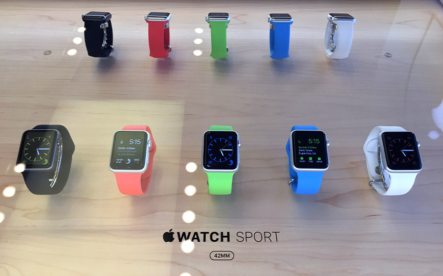
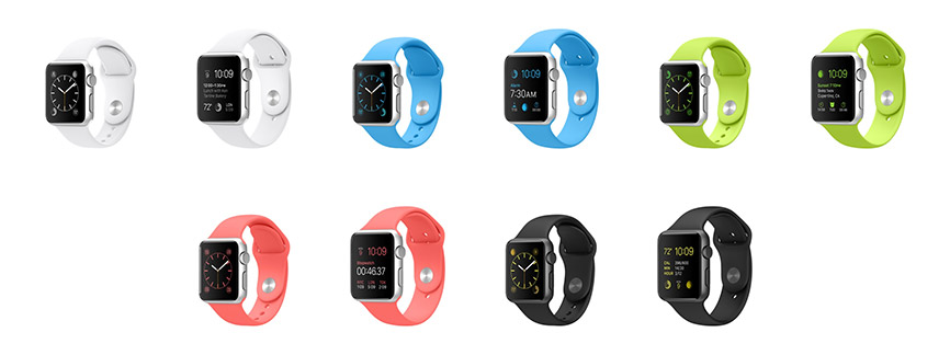
Changing the strap on the watch completely transforms its appearance and the mechanism to do so is so simple – it literally takes a few seconds. I was astonished at how a seemingly simple change had such a dramatic impact on the appearance. I see now why Apple made so many straps. To me this was actually the most interesting thing about the watch – they’re all identical under the hood but its style and degree of customisation is what makes it special – and it’s this I’ll focus on here. If you want to read about the performance or tech there are more than enough reviews out there covering the topic in detail already.
In my opinion the Sport watches only really work with the fluoroelastomer bands. Trying to put a Leather Loop band on an aluminium watch is like putting a baseball cap on with a suit – some people may be able to pull it off, but most of us will recoil at the visual and cultural mismatch and avoid such contrasting statements. This is also made clear in Apple’s marketing of the Sport.
The steel watches however are extremely versatile. They work with the fluoroelastomer straps extremely well, and of course all other straps in a way the aluminium does not. Just a subtle change in case material makes an enormous difference to the compatibility of textures, colours and complimentary materials. The leather loop was much more sophisticated than I was expecting and I actually rather like it. It doesn’t feel like fine leather in the traditional way you expect, but the many magnets holding it in place seem as sturdy as any other clasp and the thinness of the strap has a slimming effect on the entire watch that completely transformed its appearance. I wasn’t expecting to like this at all, but on reflection I think it was my favourite. It does have a slightly plastic-ey feel to it, the way Apple leather phone cases do too, but I feel this helps give it the structural support needed for the design of the straps and perhaps protects it from absorbing moisture. Imagine replacing a £130/$149 strap annually because it started to smell of old sweat, perhaps Apple has solved this too? In contrast the fluoroelastomer straps give the whole watch a slightly chubby appearance that definitely fits more with the sport/hard-wearing aesthetic.
My personal favourite before seeing these in person was the Steel with the link bracelet – I’ve always liked the idea of a watch and strap to being a single material as if the strap was an extension of the body. At first glance the uniformity of materials looked exciting to me, and the mechanism to remove links and adjust the length of the strap is ingenious. Something you need specialist tools and a skilled jeweller to do with most other watches. After a few minutes wearing it I didn’t manage to get any hairs caught in the links either. But I didn’t like the clasp – although well made and utilising an interesting butterfly mechanism, once closed I felt the look of the clasp when viewing the underside of your wrist looked incredibly austere and cold. Working with steel is a hard balance to crack and its easy to take the industrial angle a bit too far. It feels like it’s been designed to within an inch of it’s life, like too much has been taken away, it feels more like a prop from the set of Star Trek than a consumer good from the 21st century. Some may love this, but personally I prefer a warmer feel.
The classic buckle to me looked a little out of place – an overly traditional strap for a paradigm shift in watch technology. It felt comfortable and well made, but I liked the look of the other straps better, they all made the watch feel more unique, the classic buckle felt a bit ordinary to me, too safe. My least favourite was actually the Modern Buckle, I found the mechanism secure and easy to operate, but once closed I felt it looked a little bulbus as the buckle is noticeably wider than the strap itself drawing a lot of attention to the underside of the wrist, more than I liked, but again it has a unique style and can imagine it appealing to many, including two other people I saw trying it on at the same time who seemed to love it.
I didn’t have time to try on the Milanese Loop, but I did feel it and it was super-smooth but to my eyes definitely more feminine. Again the magnets did a surprisingly good job of securing the watch and I’d have no worries about running with this strap.
What struck me most was how different the watch looked and felt with each configuration. Every combination has its own set of benefits and compromises, it’s just a matter of finding out which ones suit you best. With the combinations possible it seems there must be a model for everyone.
It seems opinions on these style based judgements are very individual and varried, as you’d expect with fashion. What I wasn’t expecting is to see so much variation possible in what on the face it appeared to be a straight forward decision. I liken it more to walking into a clothing shop to get a new outfit and finding the combination of a few clothes you think suit you. Everyone leaving will have their own preferences and have a different selection in their shopping bags, and to understand this product more you need to shift your thinking from tech to fashion.
Interestingly, amongst a drawer full of at least 16 watches at each try-on station there were only two sport watches, one space grey in 42mm with black fluoroelastomer strap, and a 38mm standard aluminium model with a white strap. The rest were all steel models (Editions are a whole other experience provided in a separate, private room) which changes my perception about the marketing and which models Apple might sell more of, partly because of the strap versiltility with the steels. But also I thought because of the relatively steep entry price of the lowest price model, we might see a waterfall effect through the range in popularity; Apple would sell an overwhelming majority of Sport watches, a fair number of steel watches and a handful of Editions. After both seeing these in person and seeing people’s reaction to the models in store, I now think Apple might actually sell more steels than sports. Every other person I observed having a try-on whilst I was in store seemed to be totally convinced they’d be buying one, and going for Steel. I doubt Apple will reveal the figures, but I wouldn’t be surprised if they sell almost as many Steels in the long run as they do Sports, and I expect they have manufactured numbers accordingly. I think they have learned lessons from the iPhone 5s & 5c experiment – offering a lower end, more colourful option suits some people, but more tend to go for the more premium slightly more expensive option. If they can see the value and like the style of the device, they will pay for it.
So my experience of try-on has completely changed my opinion. I spent most of my time in the appointment wearing the 38mm Sport with white Sport Band and I think this is the watch for me. I didn’t feel the 42mm was too large by any means, but I have pretty standard large man hands but small wrists, and on my slender joints I felt the 38mm was just that little bit more discrete, I enjoyed the extra 5 grams saved in weight (really, it’s noticeable, just) and didn’t feel that the smaller screen would in anyway limit my ability to interact with the device or read it. The slightly reduced battery capacity concerned me a little, but I am a notification controller and do not open the floodgates to any or all notifications, so hope the battery will last a day. If not it’s going back and I’ll revert to the 42. I’m bound to replace it with a new model once available, so the smaller watch will have the added benefit of being more acceptable for the Mrs who will be the recipient of the hand-me-down.
So I have changed my order to a 38mm Sport in white. If this was not a first gen product I would most definitely be going for the Steel Watch with Leather Loop. Once I am convinced the product is more competent, is a genuinely useful partner device to my phone, and it has proven it will enhance my daily experiences, I’ll be convinced to lay down more coin for a model I genuinely desire. My advice is if you can wait, go and try before you buy, as the impression given by the website and the extremely close-up photography used in promoting these devices online creates a very different impression to handling the devices and straps in person.
As a side-note, I’ve been wanting an excuse to move from my iPhone 6 to a 6 plus (#Mykewasright) and the watch might just make that transition a more realistic choice. Small watch, big phone.