Useful is better than delightful.
Before I start, a little bit of context. In the beginning of 2015 I gave a presentation where I framed animation as an essential discipline to design a good user experience, I talked about the 12 basic principles of animation, underlining which ones make sense in UI animations and all that shebang.
The 12 basic principles of animation beautifully animated by Cento Lodigiani
More than two years later I’m more than aware that this is not exactly breaking news or is it going to shatter any ceilings. Companies like Apple & Google really made the effort to integrate animation in their products and by consequence facilitating and encouraging Developers & Designers across the world to do the same, and so they did.
This was definitely a step in the right direction but along the way I think we’ve accidentally stepped on something brown, and it stinks a little.
WAIT! Don’t pull out your pitchforks and torches just yet, let me first explain what I mean with a personal story.
Let’s go back in time to 2003. I was just getting started in graphic design and had little to no knowledge about it. I remember the first tool I learned how to use was Macromedia Freehand, and it was mind blowing. The possibilities were endless. Gradients, drop shadows, comic sans, you name it and I was using it all together. The result? Well, as you probably can imagine it looked like a mess. But don’t give the young me a hard time, I was an unsupervised kid in a candy store, so I ate all the candy that I wanted and ended up with a belly ache. Just like John Snow, I knew nothing.
Back to the present. You’re probably asking: What does this have to do with animation? I think, EVERYTHING. Developers and Designers are the young me in this story, and in many apps and websites they’re using animation recklessly, defeating the whole point of improving the user experience with animation.
Now, I could go through a series of examples and point out what they’re doing wrong but, honestly, that sounds kind of lazy. Instead I thought it could be more useful for you, reading this article, if I point out how (in my humble opinion, of course) animation can be integrated in a way that is not superfluous but rather an essential piece of a good user experience. So, after some time thinking and researching I came up with a list of 6 guidelines that I hope can be helpful for your animation endeavours.
Let’s start with the obvious one.
1. Animation shouldn’t be an afterthought.
You have all your interactions defined and visual design locked down to the pixel but you feel like something is missing. Then you might think “time to flair it up with some animation”. Big mistake and one of the reasons why animation is being so misused. It’s been considered at the end of the design process with the same consideration you would put into a transition effect in PowerPoint, and that’s just wrong.
Think of the user experience as a cake. In most cases animation is being thought as the cherry on top of the cake but I completely disagree with that approach. I think animation should be just another ingredient that you need to mix into the cake batter.

This to say that animation should already be in your head when you are sketching your wireframes. It can be as simple as an arrow indicating where a certain object is going to go after a button is pressed or a simple note. Keep it simple, this will help you find a purpose for the motion (or a motion for a certain purpose) without focusing too much how it looks. This also helps you not to become too attached, because animation won’t always be the solution to your problem. Just discard it if it’s not helping you accomplish something, unnecessary animation will just be an obstacle for the end user.
This takes us straight to the next guideline.
2. Animation must serve a purpose.
Gratuitous animation will just take you user’s precious time and after the first initial delight the user will get tired of it, that’s why animation needs to be functional. If you’re wondering what animation can help you with, here are some examples.
Soften harsh cuts

Designer or not, we’re all familiar with this. You are in screen A, you press a button and BAM! A completely different screen (B) suddenly appears. Then you’re left wondering, where did you come from? Did I press the right button? What now? What if “B” is visually similar to A? The user might even think that nothing happened. This shows one of the most suitable candidates for animation, moments of change. Consider the time that takes to make the «journey” from screen A to B, what objects are kept in the screen and show your users how they got there. Don’t overdo it though, as you’ll discover further down, animation is better served "invisible".
Provide context
Sometimes you land on a screen and you’re not quite sure how to interact with it straight away. A good way to help the user is to provide a clue of the proprieties of a certain object when it is introduced. If you have a list of posts, for instance, sliding them could help the user understand that he can keep swiping to see more. You can even add another layer to this by timing their appearance in a way they slide one after the other, this will reinforce that these items are separate and you can interact with each one individually.
Let’s say that you decide to tap one of them and it opens to display the entire content for a specific post. Now the information that was previously at the same level of others is now the principal. To animate this transition is a good way to reinforce the user’s selection and also to show that you’re still interacting with the same object but in a focused state, which also gives you more screen real-estate.
Provide Orientation
When all the obstacles between the UI and the user are removed from the equation the UI becomes more physical, therefore it’s important to give the user a sense of spatial orientation. You can accomplish this by being consistent with your animations and keep your app structure simple to digest.
Consider an object that moves out of the screen to the left, if it reappears, logically, it should come from where it exited. This will help your users understand the app physiognomy and by consequence make them feel more comfortable when interacting with it. If you do it otherwise it will just create confusion and your users might even think that they’re looking at a different object.
The same applies to the visual hints present in the screen. Imagine that you pressed a list item with an arrow pointing to the right, the logical transition should be a slide from right to left, as if the user view port was moving right, reinforcing the visual clue in the UI.
Many times you’ll see the UI elements contradicting the transition. Personally I find this very annoying and I think it's something we should avoid, otherwise the animation will look intrusive to the users since it defies what they expected to happen.
Provide instant feedback.
Have you ever asked yourself, did I press that button? Did it do anything? Should I press it again? The answer probably is yes and you probably pressed it again just to realise that you actually pressed it in the first place. That’s why providing instant feedback is important, even if the app doesn’t respond instantaneously.
In a world where your finger often covers the button you’re pressing, animation plays a huge roll in providing the user the reassurance they need.

In some cases, you can even take it one step further and jazz it up a bit. Let’s say you have a “star” button in your app which is one of your “hero” actions (never seen before, I know). This is exactly when you can be playful and delight your user. Make it feel rewarding and the user will want to repeat the action. Be mindful with time, the animation needs to feel instantaneous or it will become old and annoying soon. Also, don’t jazz it up too much.
Make the content feel alive.
If your app or website has live content, like pictures, comments or some sort of counter, animation can help you accomplish two things. Smooth the addition of new elements and cushion the possible delay of loading such elements.
Storytelling.
In almost every application, there’s a place where we need to explain something that went wrong or introduce a new feature. Illustrations play a huge roll here, providing a more visual and immediate way to understand a problem and how to fix it.
If an image is better than a thousand words, imagine an animation, that's like 30 images every second.
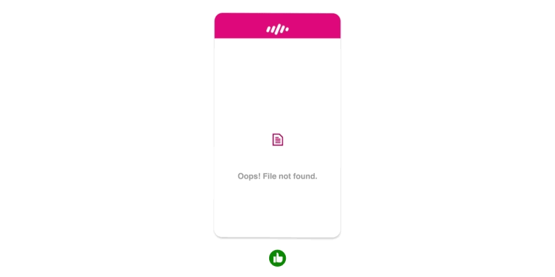
This type of screen is really the time and place where animation can shine, be memorable and bring a smile to the user’s face, especially if something went wrong. However, if your app is constantly showing an error screen, then you might want to ignore this point. The last thing you need is for your user to remember all the times that error came up.
Now that you have some clues on when and where animation can be used we must proceed to the how.
3. Animation must reflect the brand.
Consider a simple motion of an object from left to right. There are virtually endless ways to make this motion just by tweaking it’s easing curve. With this you can add a personality to your animation. See the example below, all use the same animation and timing, the only difference is the easing curve.
The possibilities are endless but, before going crazy and make all your transitions bounce like gelatine, consider your brand, your user and the tone you want to transmit. If the animation doesn’t fit the tone your users might feel out of place and lose their trust in your brand. Imagine if your banking app had the same bouncy style of animation you find in a game. Would you trust it?
It's important that your animation reflects the brand but something you must keep in mind when designing your animation is the next guideline.
4. Animation shouldn’t be the hero.
Animation is here to save the day, not like a standalone hero but more like the Ninja Turtles, fighting as a team playing on each other’s strengths. If your animation takes the centre stage, you’re not designing an experience, you’re just forcing the user to watch a movie.
Animation needs to be part of the whole experience, complementing the visual design and a supporting the interactions, to achieve this restraint is key. In most cases a good animation is the one that users don't even notice.
If you’re designing, your job is not to entertain the user but rather help him accomplish something in the easiest, most intuitive and natural way possible, and the next guideline comes to help with that.
5. Animation must feel natural
I know that the word “feel” might be ambiguous, but bear with me.
Since the user interacts directly with the UI there’s a certain expectation that the UI follows, to a certain extent, rules of physics. A list that responds to the speed you’ve interacted with is a perfect example, but the same applies to other objects.
However, this doesn’t mean that all the apps should react the same way. In the real world if you kick a ball they don’t react the same way. A football will fly away but a bowling ball will probably just hurt your foot. As I mentioned in the previous guideline, it’s all about the tone and the weight you want your brand to transmit.
You have to define what's your app's "material" and weight, and make it behave accordingly, but remember to always adjust it if necessary so it doesn't go against the next guideline.
6. Animation must not waste time
Animation can be used to tweak the user’s perception of time, so use this in your favour. For the human brain, anything below 0.1 seconds will seem instantaneous and below 1 second will seem seamless. So, if you have a process that takes 6 seconds for instance, you can break it down in a few separate animations. This trick should make the process feel a lot faster and keep your user engaged.
You can also use animation to fake an instant action that will actually take bit longer in the background. This will make the app feel more responsive even though the process still takes longer than what the user sees.
You can’t mimic everything in the real world, you need to take into account the user’s expectations. If you press a button in the UI you expect an instant feedback, thus it's not the best place to apply physics, so don't ease-in an animation in cases like this.
Ok, if you made it this far I truly believe that, if you apply these guidelines, you’re in a good path to make the best of animation and improve not only how your UI looks and feels but also how your user experiences it. Now that you know the guidelines, you still need to go over a few more jumps.
The last hurdles
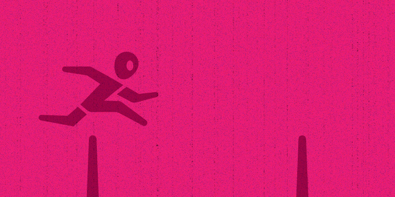
If you want your user engaged you need to provide a seamless experience and, if used right, animation can definitely help you to accomplish that. It’s not going to be an easy journey though, as with anything design related you need to be prepared for an iterative process.
You also need to know how to prototype and collect feedback, if your colleagues lack the vocabulary it's going to be hard to communicate. They won't be able to comment on your animation without using an onomatopoeia (e.g. “That button could go more like swoosh and then kablam, you know?”), for that reason I think it’s good to introduce people to the 12 basic principles of animation, so they get familiar with the terms allowing them to express themselves in a way that you can understand.
One last hurdle to go, the effort that your development team can/wants to put into animation. You really need to push through and show them that in a world where animation is becoming an intrinsic part of a good user experience the question is not if, but when are you going to have to catch up with the herd? The sooner you do it the better. Your user will appreciate it and you will reap the benefits.